

Brand Navigare Yachting
Project Type Branding & Website Update
Services Design System Extension, Logo Adaptation, Print Application, Popup & Component Updates, UI/UX Design, UI/UX Development
Team Single Senior Full-Stack Designer
Navigare Yachting has been chartering boats for more than 20 years. Recently, they joined the Blue Sea Holiday Group.
We’d already been doing periodic work for Navigare – smaller updates, occasional design and interface jobs. The standout piece was the destination pages: a fairly complex layout, and one we built ourselves over time. Navigare liked the result enough to ask for more of it.


One Small Job Led to a Bigger One
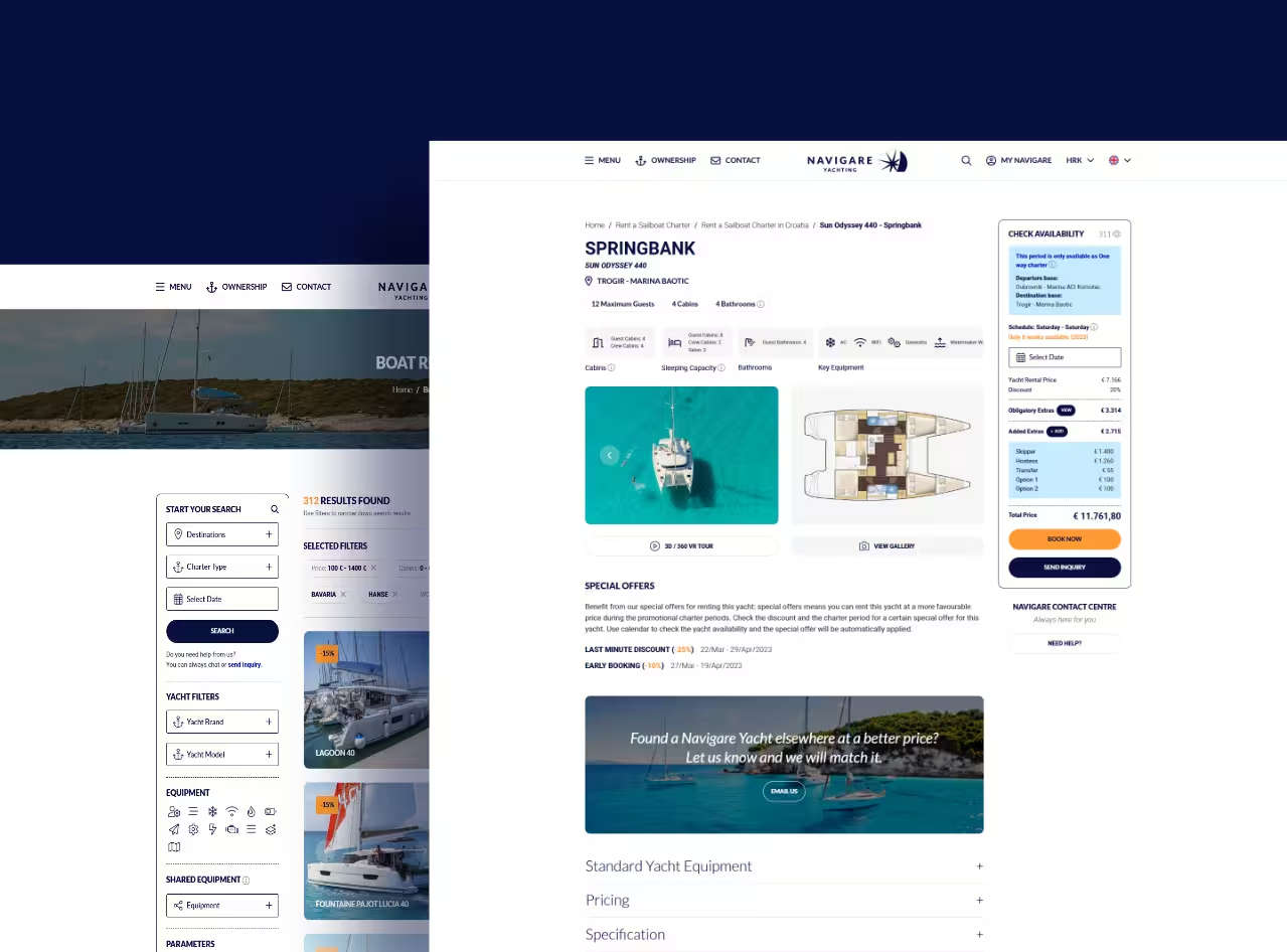
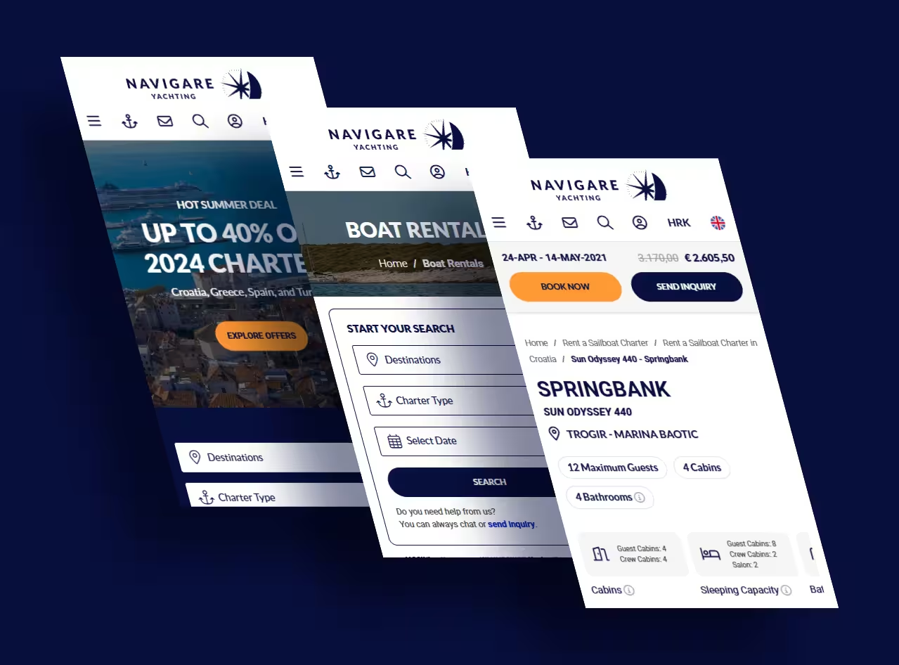
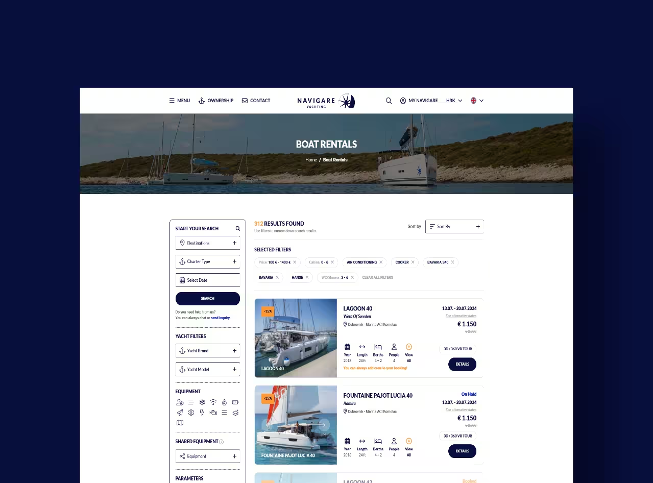
The destination pages were the proof of concept. We’d built that layout ourselves through earlier rounds of updates, and it landed well enough that Navigare came back with a bigger ask: bring the boat listing page and the boat detail page up to the same standard, and extend the same design thinking into a brand-new cabin-booking offering.
It wasn’t a clean slate, though. The existing code had to stay intact – tied to systems already running. So before changing anything, we studied it first. We traced the logic the previous designer and developer had built into the system and worked with it, not around it. Only then did the upgrades begin.
The upgrades didn’t stop at the pages we were asked to touch – most of the site’s popups got the same treatment. That’s when things expanded. Navigare’s marketing team spotted the changes and came back with a new ask: extend the branding system itself. The job covered yachts and sails, flags, banners, brochures, letters – the full physical footprint of the brand.
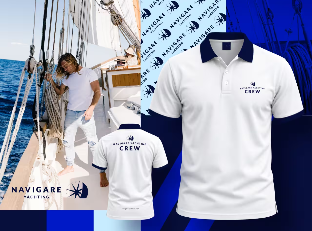
We also designed new combinations of the logo built to address skippers and crew directly, plus versions made for t-shirt printing. The original identity done by original designer was well done – no argument there. It just leaned heavily toward print, leaving the digital side underdeveloped. That’s exactly the gap we were brought in to close. And we closed it without overwriting what came before. Every rule the original designer set stayed in place.
What We Delivered
- A unified design system for boats and cabins. Listing pages, detail pages, and the new cabin-booking flow now share one visual language.
- An expanded visual identity. Logo variations now cover skippers, crew, and merchandise – not just the brand’s public face. We’ve also updated previous color palette for one additional color.
- A homepage video, produced and edited in-house. Ready to drop straight onto the front page.
- Refreshed popups, fixed on request. Every component flagged for improvement got one.
A quality website doesn’t just look good – it loads fast, ranks well, and stays out of your way. When all of that comes together, you stop worrying about your tech and start focusing on what actually grows your business. This project demonstrates that even a heavily compromised site can be turned into a performing platform with the right strategy and execution.
Got a website or visual identity that’s holding you back?