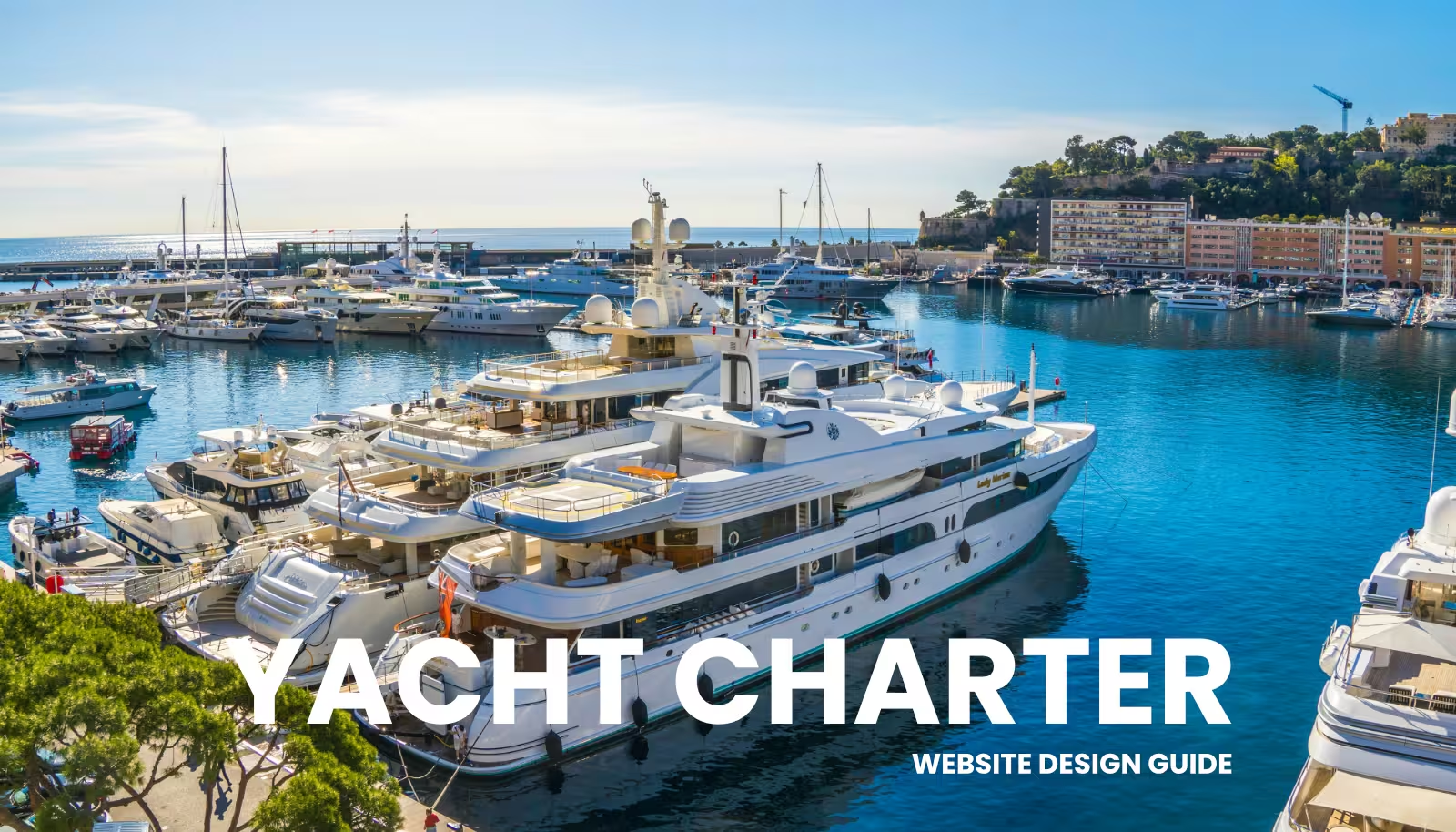


Your yachts could be flawless. Your crew, impeccable. Your itinerary, perfect down to the last sunset anchorage. But…
None of that survives first contact with the wrong colors on your website. A visitor’s brain decides whether to trust you in under a second. Color casts most of that vote before your copy gets a single word read.
Most Charter Brands Pick Colors for the Wrong Reason
Here’s how it usually goes. The founder picks a favorite shade of blue. The marketing team votes on what “feels right”. Nobody asks why. The result is a palette built on personal taste. Nothing else.
Iconic brands don’t work that way. When Carolyn Davidson designed the Nike swoosh, red wasn’t chosen because someone liked red. It was chosen for energy, motion, urgency. When Rob Janoff built Apple’s rainbow logo, it wasn’t a groovy vibe. It was a precise statement about a company built on color technology.
Talent isn’t what separates a memorable charter brand from a forgettable one. Intent is.
How Color Bypasses Logic Entirely
Color skips the rational part of the brain. It goes straight to the instinctual core, the place where gut feelings and automatic reactions live. That’s why a red clearance banner quickens your pulse before you’ve read the price. It’s why stepping onto a navy and cream yacht deck makes a guest feel, somehow, that this operator knows exactly what they’re doing.
Nobody reasons their way there. It just happens. Done with integrity, this isn’t manipulation. It’s communication. Color earns attention. Substance earns loyalty. One attracts. The other retains.
The Three Jobs Every Color Does on Your Site
Colors are doing one of three things:
- Triggering instinct – Our ancestors read color to survive: red meant danger or food, green meant safety and growth. That wiring never left. It just got redirected into marketing.
- Carrying cultural weight – Blue says “trust us”, which is why it dominates finance, healthcare, and increasingly, charter operators trying to look established.
- Controlling where the eye lands – Your brain is drawn to contrast, not beauty. A strong color against white commands attention. That’s how a well-built page walks a visitor straight to “Book Now” without them noticing they were led there.
Get this wrong, and the eye wanders. Get it right, and the path to booking becomes obvious.
The 60-30-10 Formula for a Palette That Holds Together
This isn’t a rigid rule. It’s a ratio that keeps a charter brand from looking chaotic on a page full of yacht photos, pricing tables, and calls to action.
- 60% dominant color – sets the overall mood of the site.
- 30% secondary color – adds depth and supports the dominant tone.
- 10% accent color – reserved for buttons, links, and anything you want a browser to actually click.
Every color needs a job. Not just a presence.
What Each Color Signals to a Guest
Here’s a quick read on what each color does well on a charter site, and where it backfires.
| Color | Pros | Cons |
|---|---|---|
| Red | Passion, urgency, action. | Overused, it reads as aggressive or cheap. Save it for “3 dates left this season”, not your whole homepage. |
| Blue | Trust, competence, calm water. The default for operators who want to read as safety first and experienced. | Overdo it, and the brand goes cold. |
| Green | Growth, health, nature. A strong pick for eco conscious charter brands. | In the wrong shade, it reads as inexperience. After all, yachts are not sailing through high grass. |
| Yellow | Grabs attention faster than any other color. | The most volatile. One shade too warm and it reads as a warning label instead of sunshine. |
| Orange | The call to action color, friendly and energetic without red’s aggression. It’s why so many “Book Now” buttons are orange. | Can feel cheap if overused. |
| Purple | Luxury, creativity, exclusivity. Strong for a high end superyacht brand. | Risky for a laid back flotilla operator. |
| Black | Power and sophistication. Magnetic in small doses on a luxury charter site. | Heavy and cold if it takes over the page. |
| Grey | Calms contrasts. | Calms contrasts. |
| White | The amplifier. Gives every other color room to breathe. | Alone, it can feel empty on a site that’s supposed to feel warm and inviting. |
Keep in mind, these are Western associations. Color meaning shifts across cultures. Red signals one thing in the West and something else entirely in much of Asia.
Where Guiding a Guest Ends & Tricking Them Begins
Color psychology has moved well past mood setting. Online, red isn’t just energetic, it’s a precisely targeted “click now” trigger. Green isn’t just calming, it’s the quiet reassurance of “you made the right choice“. This matters more for yacht charters than for most businesses. You’re asking people to trust you with real money for an experience that has to be flawless.
There’s a real difference between guiding someone toward a good decision and steering them into one they’ll regret. Dark patterns, like contrast traps or misleading button colors, exploit that knowledge instead of using it honestly. The standard here is simple. Guide, never deceive. Your colors should be a truthful extension of what you actually deliver. No palette rescues a bad charter experience. It only amplifies what’s already there.
Choosing Colors for Your Charter Category
Yacht charters generally fall into three categories, and which one you’re in decides almost everything about your palette. Nail this before you touch a single hex code.
Luxury Yacht Charter
Highly trained, discreet professionals: Michelin caliber chefs, dedicated stewards, on board wellness experts. Every detail is customizable, from bespoke menus to strict privacy. This covers superyachts, mega yachts, high end power catamarans, and the occasional classic gulet refitted to a luxury standard.
Think Italian marble, polished teak, brushed gold, and the crisp white of a modern superyacht:
- Monaco Pearl – Clean minimalism, heavy metals, high-fashion elegance.
(Pearl White, Champagne Gold, Soft Silver, Deep Caviar) - Capri Dusk – Regal, classic maritime luxury with a warm evening glow.
(Velvet Navy, Pale Gold, Crisp Silk White, Soft Taupe) - Emerald Coast – Lush and exclusive, inspired by Sardinia’s Porto Cervo.
(Deep Jade Green, Polished Brass, Creamy Ivory, Smoked Oak) - Cloud Nine – Ultra-modern interiors, glass, airy wellness spaces.
(Alabaster, Dove Gray, Ice Blue, Platinum) - Cognac & Cashmere – Masculine, evening cigar-lounge energy.
(Warm Cognac, Cream, Matte Black, Brushed Bronze)
Traditional Yacht Charter
This category trades ultra modern minimalism for history, local charm, and an unhurried pace. Warm, knowledgeable local crews double as regional guides, cooking family style dishes and sharing coastal history most guests never hear elsewhere. Think classic luxury wooden gulets, schooners, and traditionally rigged sailing yachts.
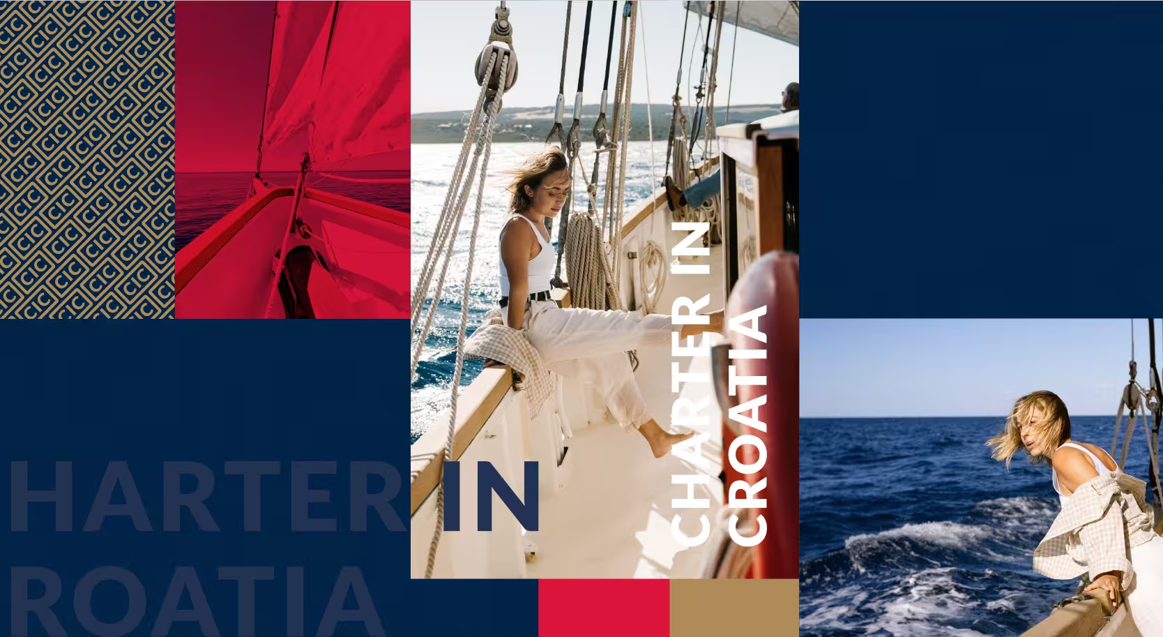
One of our clients, Charter in Croatia, specializes in exactly this kind of yachts. You can see how we built their site, or book directly with them if this category speaks to you.
Palettes here come from weathered wood, aged brass, canvas sails, and the natural hues of a historic Mediterranean coastline:
- Adriatic Heritage – Rooted in Croatian stone villages and coastal nature.
(Weathered Oak, Terracotta, Sea-Salt White, Olive Grove Green) - Old World Marine – Classic sailing heritage, antique compasses, heavy rope.
(Vintage Navy, Aged Brass, Canvas Beige, Deep Crimson) - Aegean Breeze – Rustic, wind-swept island hopping.
(Aegean Blue, Washed Linen, Sun-Bleached Driftwood, Wild Sage) - Sunset Gulet – Polished wooden decks under a Mediterranean sunset.
(Rich Mahogany, Burnt Amber, Apricot Sky, Charcoal) - Spice Route – Exotic and rich with cultural texture.
(Mustard Yellow, Copper , Distressed Teal, Warm Sand)
Fun Yacht Charter
Built entirely around entertainment, adrenaline, and turning the ocean into a playground for younger clients. High energy crews come with dedicated water sports instructors and bartenders who specialize in beach party cocktails. Flotillas are the signature move: once the party starts, every catamaran and sailboat rafts up in calm anchorages for social gatherings.
High contrast, sun drenched palettes that match the energy of water sports and daytime cocktails:
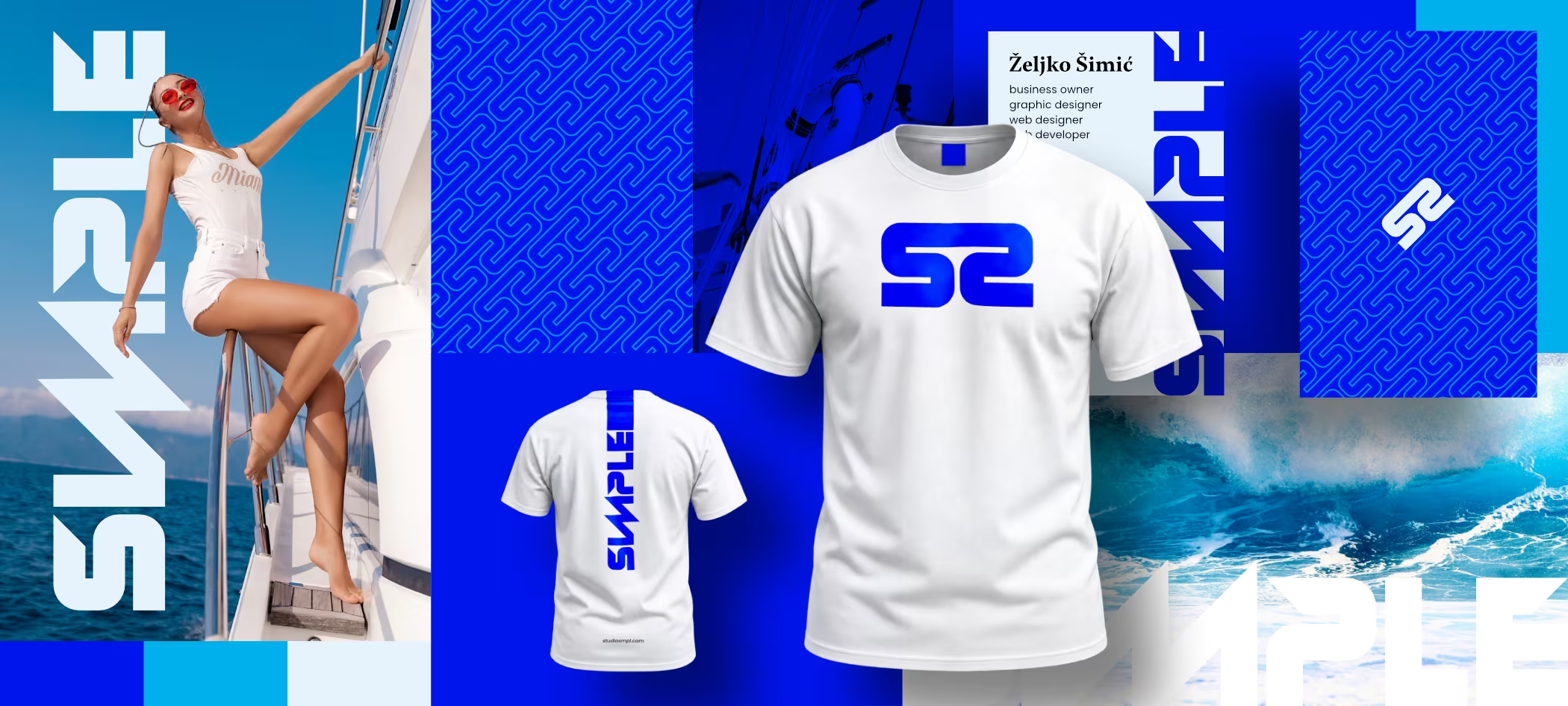
- Ibiza Neon – High-contrast energy, built for daylight pool parties.
(Electric Turquoise, Hot Coral, Bright White, Sun Yellow) - Hvar Beach Club – Trendy, social, sunset-cocktail chic.
(Spritz Orange, Pale Rose, Crisp Aqua, Terrazzo Gray) - Cayman Surf – Youthful and action-oriented, built for water toys and jet skis.
(Mint Green, Neon Lime, Deep Ocean Blue, Shell Pink) - Dayglow Island -Night-party energy with neon LED deck lighting.
(Magenta, Electric Blue, Charcoal Black, Platinum Silver) - Bikini Bottoms – Laid-back, cheerful, all about daytime fun in the sun.
(Peach, Lemonade, Sky Blue, Coconut Husk Brown)
Stick to no more than five colors, no matter which category you land in.
One more scenario worth naming: if you’re a young brokerage team whose energy doesn’t fit neatly into one category, combine two palettes. Just make sure the combination doesn’t fight your charter type or your spirit. Clashing colors send mixed signals. A confused visitor doesn’t stick around to figure out what you meant. They leave.
The Bottom Line
Color shapes a customer’s first impression faster than almost anything else on the page. Research from the Institute for Color Research suggests up to 90% of that snap judgment comes from color alone, and consistent color use can lift brand recognition by as much as 80%.
Pick your category (luxury, traditional, or fun), pull one palette from the lists above, and apply the 60-30-10 ratio to your homepage this week. Don’t redesign everything at once. Fix the hero section and your primary “Book Now” button first, then expand from there. And if you need help, send us an inquiry about the idea you have.
Your yacht charter branding colors aren’t a personal preference. They’re infrastructure of your brand.
Frequently Asked Questions
Which color palette should a yacht charter business use?
It depends entirely on your category. Luxury charters need materials inspired palettes built from marble, gold, and deep neutrals. Traditional charters need warm, weathered tones pulled from wood and coastline. Fun charters need high contrast, tropical colors that match a party atmosphere. Picking a palette before you know your category is how brands end up with a chaotic, unconvincing site.
How many colors should a charter website actually use?
Three main colors, structured around the 60-30-10 ratio: one dominant color covering 60% of the visual space, one secondary color at 30%, and one accent color reserved for the last 10%, used for buttons and calls to action. More than that, and the brand starts to feel unfocused.
Is using color psychology to increase clicks manipulative?
Not when it’s honest. Guiding a visitor’s eye toward your booking button with contrast and color is standard design practice. It becomes a problem when colors are used to trick someone, through contrast traps or misleading button styling, into a decision they wouldn’t otherwise make. The line is whether the color reflects what you actually deliver.
What if my charter brand doesn’t fit neatly into one category?
Combine two adjacent palettes rather than forcing a fit. This works well for younger brokerage teams or hybrid operators, as long as the combined colors don’t contradict each other. A luxury brand borrowing a single warm traditional accent can work. A luxury brand painted in neon party colors will not.
If you’re rethinking more than your palette, here’s our complete guide to yacht charter website design, the same framework we use with every charter client from first brief to launch. Or if you want a second pair of eyes on where your current site is helping or hurting you, start with an audit. No pitch, no pressure.