

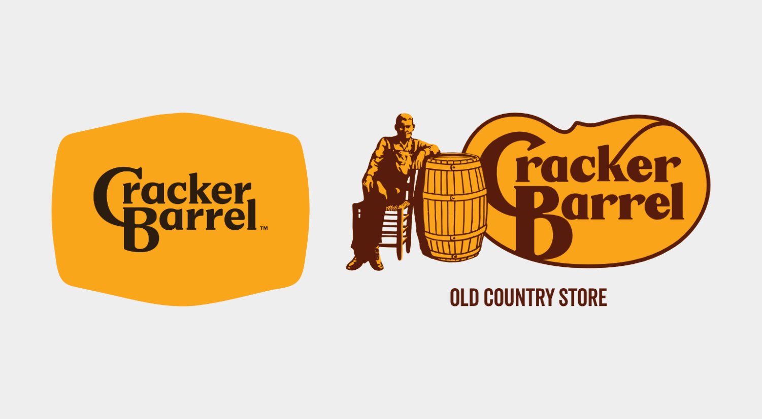
A logo redesign is supposed to be a quiet, internal decision. Cracker Barrel’s was not.
Within days of unveiling a sleek new look, the backlash hit like a tidal wave. Customers didn’t just complain. They revolted. And Cracker Barrel did something almost unheard of in modern branding: it listened, reversed course, and brought the old logotype and logomark back.
Authentic emotional connection is priceless. Betraying that connection for a trendy look is a catastrophic gamble.
The Logo Was a Promise
Since 1977, Cracker Barrel’s logo has done more than identify a restaurant chain. It told a story.
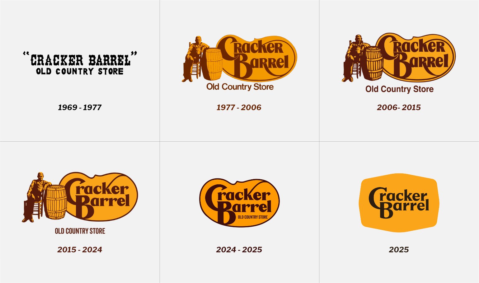
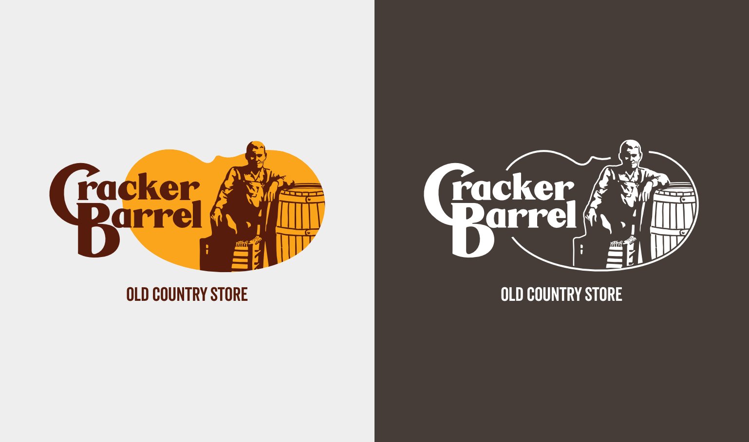
“Uncle Herschel” leaning against his barrel wasn’t just an illustration. It was a portal – one that led straight to warmth, comfort, and the feeling of pulling into a familiar parking lot after a long drive. Those bold, sturdy letters didn’t just spell out a name. They said something simpler: welcome home.
That kind of visual shorthand doesn’t come from a mood board. It’s built over decades, one meal and one road trip at a time. And it created something most brands chase and never catch: instant, gut-level trust.
Where the Rebrand Went Wrong
The new design chased a trend instead of protecting a legacy. It landed in the same flat, minimalist territory as half the restaurant industry.
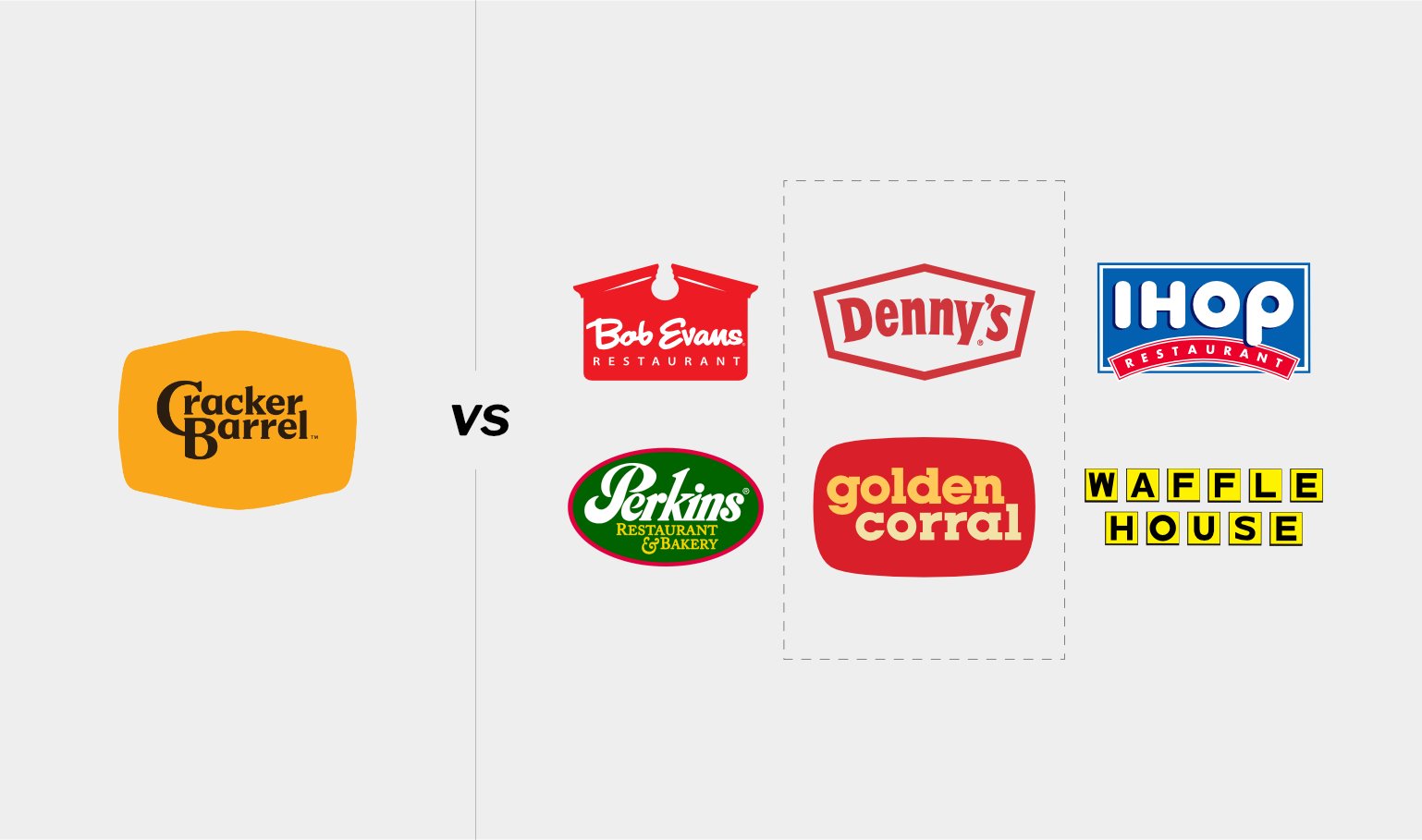
Clean? Sure. Distinctive? Not even close.
The problem was… the redesign erased the very thing that made Cracker Barrel recognizable. Strip away the illustration, and you strip away the story. What’s left is a logo that could belong to any chain – Bob Evans, Denny’s, IHOP, take your pick.
The mistake wasn’t one decision. It was three, stacked on top of each other:
- A generic design. The new logo blended into a sea of lookalike competitors instead of standing apart from them.
- A blindsided customer base. The backlash revealed a real disconnect between leadership and the people who’d built loyalty to the brand for decades.
- A basic misunderstanding of what “brand” even means. A logo doesn’t make a promise. It just reminds people the promise exists.
When customers saw the new mark, they didn’t see progress. And they said so, loudly.
Listening Was the Real Win
Facing a full-blown customer uprising, Cracker Barrel had two options: dig in, or admit the miss.
They chose the harder, smarter path. They brought the old logo back – and started addressing the service and quality issues customers had been quietly frustrated by all along. That’s the part worth remembering. Respecting your heritage is a strategic move. Reversing a bad call, fast and publicly, did more for customer trust than the original rebrand ever could have.
Refresh a Brand Without Erasing It
None of this means brands should freeze in time. Evolution matters. But there’s a right way to do it – one that carries your identity forward instead of leaving it behind.
For Cracker Barrel, that might have looked like:
- Keep the soul. Uncle Herschel stays. He’s not baggage – he’s equity.
- Refine, don’t replace. Modernize the lettering. Adjust the palette for today’s eye. Just don’t erase what makes you recognizable at a glance.
- Let the experience carry the story. Deepen what makes the brand special by improving what happens inside the restaurant – not by redrawing what’s on the sign outside.
Four Questions to Ask
Every brand eyeing a redesign should run through this checklist first:
- Do you actually know what customers love about you? Nostalgia isn’t a vague, sentimental feeling – it’s a psychological anchor. Find out what it’s anchored to before you touch a single pixel.
- Are you protecting your sacred assets? The best updates amplify what already works. You don’t need to reinvent the wheel. You need better tires.
- Are you listening to loyal customers, or just internal stakeholders? Customer feedback is your early warning system. Ignore it, and you’re flying blind.
- Is your uniqueness still doing its job? In a market full of sameness, distinctiveness is your only real edge. Dilute it, and you disappear with everyone else.
This is how you move forward. Not by leaving your identity behind, but by carrying it proudly into tomorrow.
The Question Nobody Wants to Ask
The uncomfortable truth hiding under all of this is that most brands that think they need a new logo actually need something else entirely. They need to reclaim quality they’ve quietly let slip. Your visual identity is the cover of the book. If the chapters inside – service, consistency, the actual experience – stop delivering, no amount of redesign fixes that.
So ask yourself honestly: does your business need a new look, or does it need to deliver on the promise it already made?
More often than not, it’s the second one. If your brand is still recognized but loved a little less than it used to be, the logo was never the problem. What you stopped delivering was. Customers remember the promise. When the quality fades, they don’t blame the design. They blame you.
Redesign should follow real improvement to signal to customers that something has genuinely shifted in how you do business.
The Bottom Line
Cracker Barrel’s saga makes it clear that a brand’s power lives in the gut, not the retina. The old logo wasn’t just familiar – it was trusted. That kind of trust doesn’t come from a font.
If you’re a leader eyeing a rebrand, evolve. Grow. Just don’t forget what made people choose you in the first place. Forget that, and you’re not refreshing a brand. You’re starting over from zero – and hoping customers give you a second chance they may not offer twice.
Before your next brand meeting, skip the moodboard. Pull ten years of customer feedback instead. If the complaints are about quality, not aesthetics, you already have your answer – fix the product, not the logo.
Disclaimer: This is an unsolicited design commentary piece. Cracker Barrel® is a registered trademark of its owner. This article is not affiliated with the company. All logos and branding referenced are used for demonstration, education, and critical commentary purposes only.