You’ve decided to invest in a logo. Maybe you’re starting a business. Maybe you’re rebranding. Either way, someone — a designer, a consultant, a well-meaning friend — is about to tell you a lot of things about what a logo is and what it needs to do.
Some of what they say will be true. Some of it will be incomplete. And some of it, if you’re unlucky, could quietly set your business up for a legal problem that doesn’t surface until you’re big enough to be worth going after.
Your logo is not your brand. Your logo is not your values statement. It is not your elevator pitch, your company story, or your competitive advantage compressed into a symbol.
Your Logo Has One Primary Job
Your logo is an identifier. It tells people — at a glance, consistently, across every surface it appears on — that this is you. That is its job. Everything else your brand communicates — quality, trustworthiness, personality, the feeling of doing business with you — is built through your product, your service, your consistency, and your customer’s experience over time.
A logo that tries to say everything ends up saying nothing clearly. But — and this matters — a logo that says nothing intentional from the start is a gamble on your money and your time.
Literal or Abstract — What’s Right For Your Business
One of the first decisions in logo design is whether your mark should literally represent what you do or work more abstractly as a symbol. This is not a question of what’s fashionable. It’s a question of what your customers need from you before they trust you.
If you run a construction company, a law firm, or a school, your customer is making a significant decision — their home, their legal case, their child’s education. They need to understand what you are before they feel safe engaging. A logo that clearly communicates your industry, through its form, its weight, its visual language, helps remove that initial barrier. That’s not a failure of creativity. That’s understanding your customer.
If you’re building a lifestyle brand, a product line, or a business that plans to grow across multiple categories, a more abstract or symbolic mark often serves you better. It gives you room to expand without your identity becoming a cage.
The honest answer is that the right approach depends on your business, your industry, and your customer — not on your designer’s personal preference. If a designer tells you that literal logos are outdated or that abstract is always better, ask them to explain why that’s true specifically for your business and your customer. If they can’t give you a clear answer grounded in your market, that’s a red flag. Because they are about to use your business as a test subject for their portfolio. They don’t care about your business.
What Great Logo Design Actually Looks Like In Practice
Nike’s swoosh was designed in 1971 as a wing — a direct reference to the Greek goddess of victory — because Nike’s founders knew from the start they weren’t only building a shoe company. They needed a mark flexible enough to follow the brand into any category, any sport, any market. The meaning of movement and victory wasn’t something Nike stumbled into over time. It was the intention from day one. What decades of athletes, campaigns, and culture did was prove and amplify that intention — not create it from scratch.
Nike also understood that different products within the same brand can use different approaches. The Jordan “Jumpman” is a direct, literal silhouette of Michael Jordan mid-jump. Specific, recognizable, product-tied. Both marks exist within the same brand family, used intentionally for different purposes.
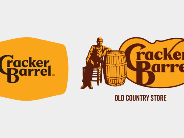
Apple went through more turbulence. The original 1976 logo was cluttered and impractical — it was replaced quickly. The apple mark that followed was designed with knowledge, curiosity, and innovation as its declared meaning. The brand then spent decades proving that declaration through its products and its design philosophy. What Apple demonstrates is not that meaning builds itself over time — it’s that a brand has to declare its meaning clearly, then earn it consistently through everything it does.
Neither company handed a designer a brief and said “make something nice and we’ll figure out what it means later”. Both had a clear point of view before the logo was finalized. That clarity is what you should be bringing to your designer — and what a good designer will help you sharpen, not replace with their own.
What You Should Expect From Your Designer
A good designer listens first. They want to understand how you see your business, who your customers are, what industry you operate in, and where you plan to take the company. They bring their expertise to translating that understanding into visual language — they don’t arrive with a predetermined aesthetic and fit your business around it.
You should be able to ask your designer:
- Why this approach — literal or abstract — for my specific business?
- What does this mark communicate to someone who has never heard of my company?
- Will this work as the business grows and potentially expands into new areas?
- Can I own this outright, legally and completely?
That last question matters more than most business owners realize.
The Legal Part — Read This Carefully
Here is something that does not get discussed nearly enough, and it can be genuinely expensive to learn the hard way.
Some designers, particularly less experienced ones, but professionals also, build logos by tracing or heavily deriving from existing photographs — stock images, images found online, Creative Commons material. It looks like original work. It may even be presented to you as original work. But if the primary visual element of your logo is derived from someone else’s photograph, you may not fully own it — and that matters enormously as your business grows and your competitors grow desire to remove you from the market.
Licences and Authorship
If the source was a licensed stock image from a platform like Shutterstock or iStock, the original photographer retains copyright over their work. A logo derived from that image without the appropriate commercial license is an unlicensed derivative. The photographer, or the platform acting on their behalf, can pursue infringement claims, royalty demands, or forced rebranding. If the derived element carries most of the visual weight of your logo — if it is the logo, essentially — courts have ruled in many cases that the original author retains significant ownership of the resulting work.
If the source was a Creative Commons image, the license typically requires ongoing attribution to the original author. If that attribution isn’t maintained correctly and consistently, you’re in breach. That breach is actionable.
If it was a free commercial use image, you need to be able to produce the license documentation on demand — not eventually, immediately — if you’re ever challenged.
Make Designer Responsible for his/her Work
And here is the practical reality that makes this particularly dangerous for growing businesses: the evidence of what was used is often still sitting on the internet. The original photograph. The stock library listing. The file metadata. As your business becomes visible and successful, competitors notice. Reporting an unlicensed logo costs them nothing. The consequences for you can include legal fees, royalty payments, a forced rebrand at the worst possible moment, and in serious cases, enough financial disruption to genuinely threaten your business.
Before you finalize any logo, ask your designer directly: Is this entirely original work created from scratch? If any reference material was used, what was it and what is the license? A professional designer will have a clear, immediate answer. If the answer is hesitant, vague, or defensive — get it in writing before you pay the final invoice, and consider having an IP attorney review the work before you put it into market. In that way you can push responsibility onto your designer.
What Your Logo Needs To Do Before It Leaves The Designer’s Hands
When you see the final logo, ask yourself one question before anything else: does this feel like my business?
Not “do I like it aesthetically”. Not “is it trendy”. Does it feel true to what you’re building, who you’re serving, and where you’re going? If you look at your logo and feel nothing — no recognition, no pride, no sense of identity — that is a problem worth solving before launch, not after. Because your relationship with your own logo determines how consistently you use it, how confidently you present it, and how seriously you take the work of building a brand around it. Consistency is what makes a logo mean something to your customers over time. And consistency starts with you believing in it.
A logo that means nothing to you on day one will mean nothing to your market on day one thousand.
The Bottom Line
Your logo is an identifier, not a complete communication of everything your business is. It should be literal or abstract based on what you need — not based on design trends or your designer’s preferences. It should carry clear, intentional meaning from the moment it’s finalized — meaning you defined, not meaning you’re hoping will develop eventually.
It should be entirely original, legally clean, and fully yours.
And it should be something you’re proud to put on everything you build — because that pride is what drives the consistency that eventually makes it mean something to the people you’re trying to reach.
Demand that standard. You’ve earned the right to it.