Cracker Barrel’s logo change shows how chasing trends can backfire by stripping away the very nostalgia that built the brand. After a tsunami of customer outrage, Cracker Barrel scrapped the new design entirely and resurrected the old logo.
Authentic emotional connection is priceless. Betraying that connection for a trendy look is a catastrophic gamble.
Three Mistakes in One Rebrand
Generic Logo Design
The new logo became invisible — a bland design that blended into a sea of competitors rather than standing out.
Furious Customers
The backlash exposed a dangerous disconnect between the company and its core customers.
A Misunderstanding of Brand
Your brand isn’t your logo. Your brand is the promise you keep every single day, the logo just amplifies the level of quality you offer to your customers.
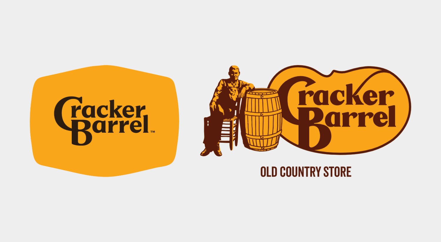
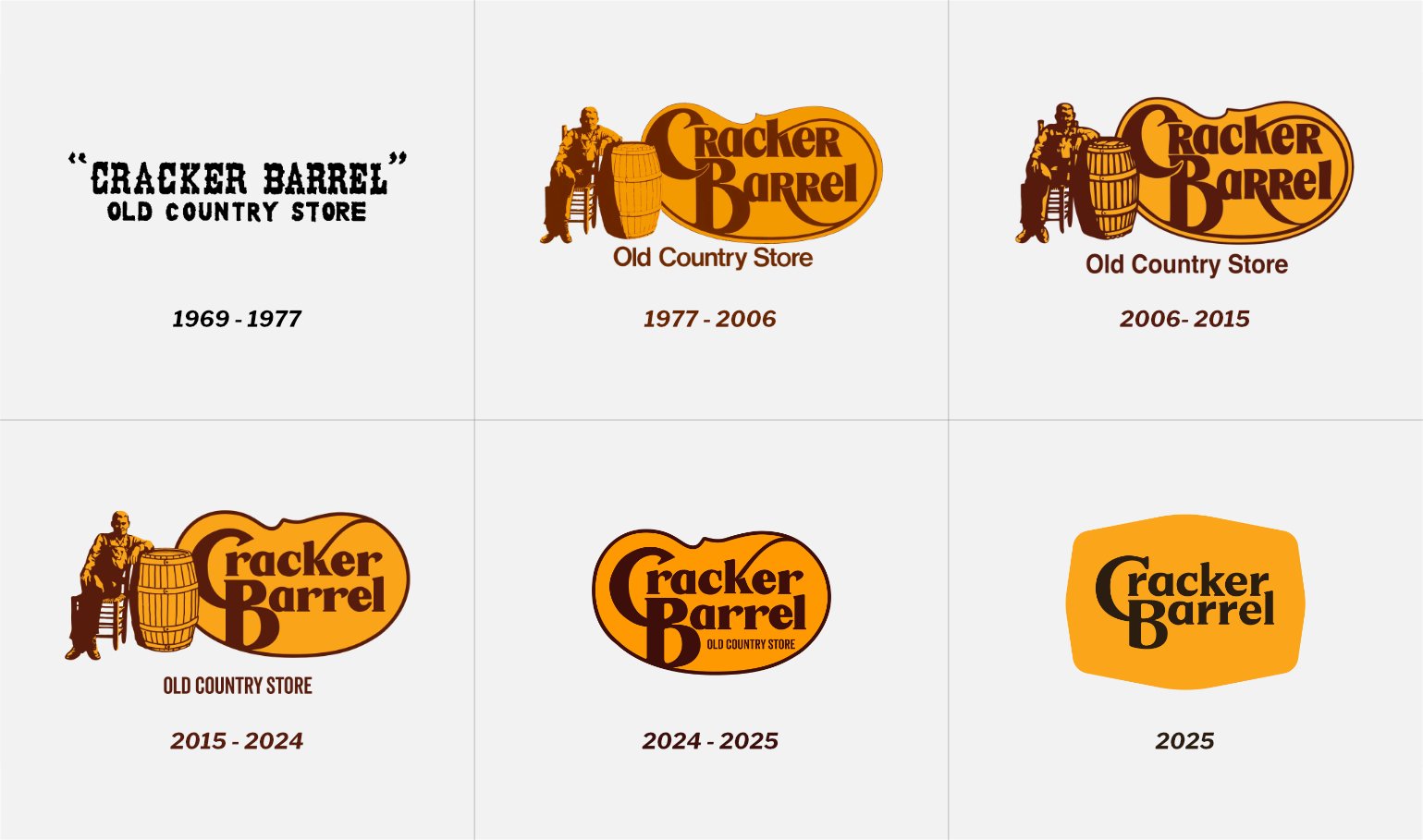
A Logo With 49 Years of Legacy
Since 1977, Cracker Barrel’s logo was far more than a sign. It was a storybook. “Uncle Herschel” leaning on his barrel wasn’t just a drawing — it was a portal to warmth, nostalgia, and comfort. Those bold, sturdy letters didn’t just state the name. They whispered: “Welcome home.”
This identity created instant, gut-level trust. In a crowded marketplace, it was their fortress.
The “Modern” Makeover That Misfired
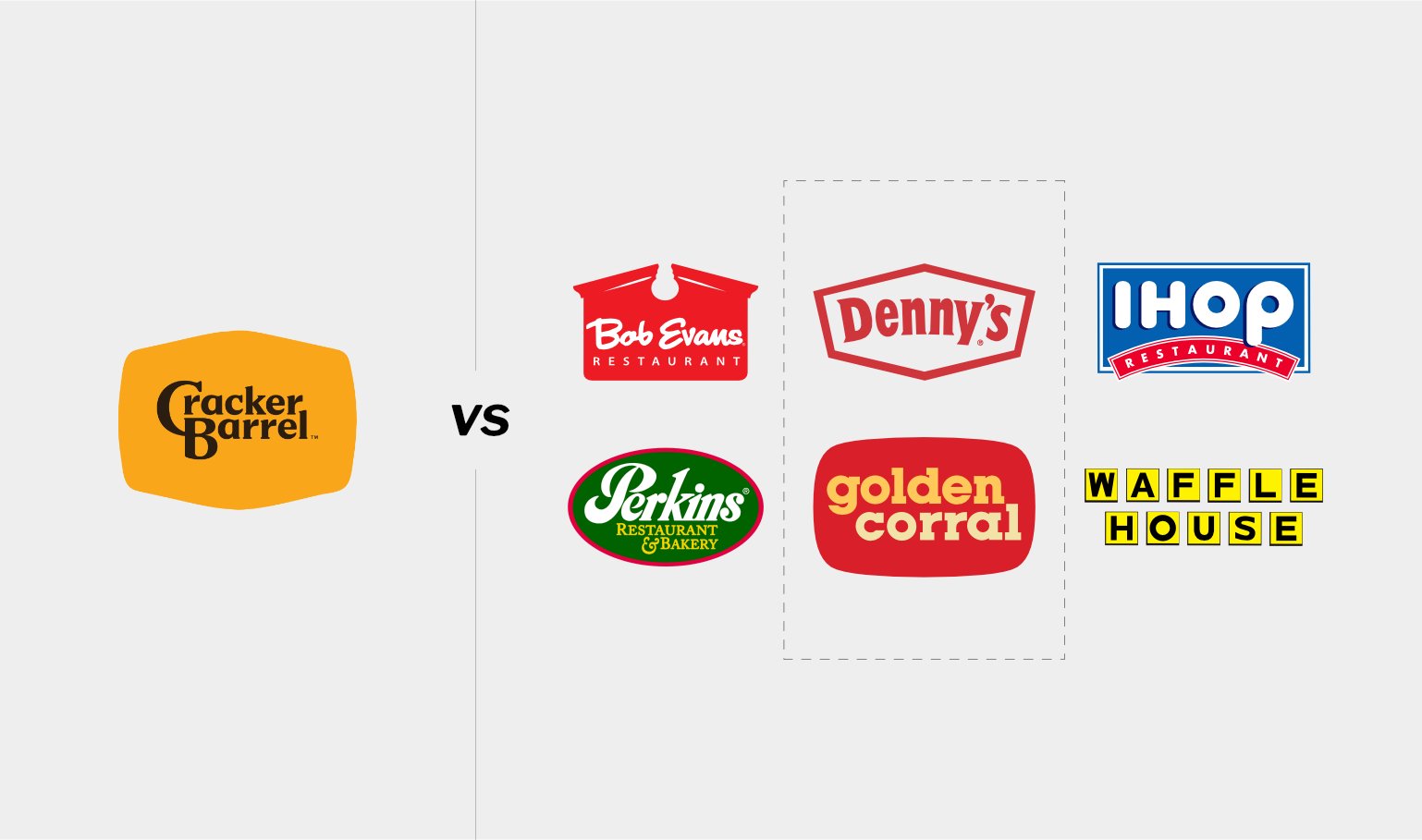
The new logo fell into the seductive trap of flat, minimalist design. It was too “clean”. But it came at a devastating cost: character. By stripping away the unique illustration and charm, they erased their own story. The logo didn’t evolve – it surrendered. It became a bland ghost that could belong to any chain restaurant. When customers saw it, they didn’t see progress. They saw abandonment. The customers’ verdict was swift and brutal.
A Victory for Radical Authenticity
This wasn’t a minor complaint. This was a passionate uprising from the people who lived the brand. Cracker Barrel faced a defining choice to ignore their lifeblood or honor it.
They chose to listen. And in doing so, they did more than fix a mistake — they fortified their relationship with customers. They proved that respecting your heritage isn’t old-fashioned. It’s the strategic power move. Not only that they kept the old logo, they also started working on bringing back the quality of service. That is how you bring people around your brand.
How to Evolve Without Erasing
So what’s the real alternative? How do you refresh without destroying? A true evolution honors the past while moving toward the future. It doesn’t leave your identity behind — it carries it forward. For Cracker Barrel, this might have looked like:
- Keep the soul. Uncle Herschel stays. He’s iconic.
- Refine, don’t replace. Modernize the lettering for clarity. Adjust the color palette for contemporary appeal. But never erase what makes you recognizable.
- Enhance the narrative. Deepen what makes the brand special — not by changing the logo, but by making sure the experience inside matches the promise on the outside.
This is how you move forward. Not by leaving your identity behind, but by carrying it gracefully into tomorrow.
What Every Brand Can Learn From Cracker Barrel’s Crisis
Know Your Audience’s Heart, Not Just Their Habits
Nostalgia isn’t a dusty feeling. It’s a psychological anchor. Before you change a single pixel, find out what your customers truly love about your brand.
Protect Your Sacred Assets
The best updates amplify what already works brilliantly. Don’t reinvent the wheel (keep it round and use better tires).
Listen Like Your Business Depends On It (Because It Does)
Loyal customer feedback is your crystal ball. Ignoring it is strategic suicide.
Cling to Your Uniqueness Like a Life Raft
In a tidal wave of sameness, your distinctive character is your only edge. Dilute it, and you drown.
The Real Question Nobody Asks Before Rebranding
Here’s the uncomfortable truth: a lot of brands don’t actually need a new logo. They need to reclaim the quality they’ve lost. This is Cracker Barrel’s actual problem — and likely yours too.
Your visual identity is the cover of your book. If the chapters inside — the service, the quality, the experience — stop compelling people, no amount of redesign will save you. Before you invest a single dollar in a new logo, ask yourself honestly:
Does our business need a visual redesign, or does it need to deliver better quality?
Often, you’ll discover it’s the second one. If your identity is still known but loved less, the issue likely isn’t the logo. It’s what you stopped delivering. Customers remember the promise your brand made. When the quality disappears, they don’t blame the logo — they blame you.
Redesign should follow real improvement — not for the sake of change, but to signal to customers that something has genuinely shifted in how you do business. If you’ve lost your way and need a strategic partner to help reclaim your authentic promise, let’s talk. But fix the quality first. The logo will follow.
The Bottom Line
Cracker Barrel’s story screams one simple truth: a brand’s power lives in the gut, not just the retina. Their old logo was a sacred promise. Customers didn’t just recognize it — they trusted it. That’s irreplaceable.
For any leader thinking about a rebrand: move forward. Evolve. Grow. But never forget what made you matter in the first place. Because the moment you do, you’ll find yourself starting over. And your customers will remember why they left your brand and that is one thing you don’t want.
Disclaimer: This is an unsolicited design concept project. Cracker Barrel® is a registered trademark of its owner. We are not affiliated with them. All existing logos and branding materials are used for demonstration purposes only. The purpose of this article is to educate, inform, criticise, and comment on new direction the company has taken.