What if the wrong colors are silently killing your conversions? You can have a perfect product, but if your palette clashes with what your brand actually stands for, customers will click away before they even know why. That’s the unsettling part. They won’t leave you a note. They’ll just be gone.
Color isn’t decoration. For brands, it’s a weapon — and most companies never fully learn how to use it.
The Mistake Most Brands Make
Here’s where things go wrong: people treat color as a matter of personal taste. The founder picks their favorite shade of blue. The marketing team votes on what “feels right”. The result is a palette that reflects nothing except personal taste.
Iconic brands don’t work that way. When Carolyn Davidson designed the Nike identity, red wasn’t chosen because someone liked red. It was chosen for energy, motion, urgency — a deliberate nod to Nike on using Greek goddess of victory symbol. When Rob Janoff created Apple’s rainbow logo, it wasn’t a “groovy vibe”. It was a precise statement about the company’s groundbreaking color technology.
The difference between amateur and expert designer isn’t talent. It’s intent.
Why Colors Work the Way They Do
Color skips the rational part of your brain entirely. It goes straight to the instinctual, emotional core — what researchers sometimes call the “lizard brain” — the place where gut feelings, raw desire, and automatic responses live.
That’s why a red clearance banner makes your pulse quicken before you’ve even read the price. That’s why walking into a navy-and-cream bank lobby makes you feel, somehow, that your money is safe. You’re not being logical. You’re being human.
This isn’t manipulation, when done with integrity. It’s communication. Color gets attention; quality earns loyalty. The formula is that simple: design attracts, substance retains.
Three Things Colors Actually Do
It triggers instinct. Our ancestors read color to survive — red meant danger or food, green meant safety and growth. That wiring hasn’t disappeared. It’s just been redirected. Red still screams urgency. Green still signals “go”. The applications change; the biology doesn’t.
It carries cultural weight. Blue says “trust us“ — which is why it dominates finance, healthcare, and tech. Yellow is a wildcard: joy and optimism on one hand, anxiety and cheapness on the other. A skilled designers don’t just pick colors; they play a high-stakes game of Tetris with associations, stacking colors so their strengths amplify and their weaknesses disappear.
It controls where your eye goes. Your brain is drawn to contrast, not beauty. A strong color against a white background doesn’t just look good — it commands attention. This is how a well-designed page guides a visitor straight to the “Buy Now“ button without them noticing they’ve been guided at all. Get the colors wrong, and the eye wanders. Get them right, and the path becomes clear.
The 60-30-10 Rule (Your New Best Friend)
The 60-30-10 rule is simple: 60% of your visual space uses your dominant color — the one that sets the overall mood. 30% goes to a secondary color that supports and adds depth. The remaining 10% is your accent, the spice. This is the color you use for buttons, links, the things you desperately want people to click.
This ratio isn’t arbitrary. It’s why some brands feel effortlessly cohesive and others look like a ransom note. Every color needs a role, not just a presence.
If your brand’s visual identity feels chaotic, your visual designer did you no justice.
A Cheat Sheet for the Color Spectrum
A quick breakdown of what each major color actually does — and where it can backfire:
- Red is passion, urgency, and action. Misused, it reads as aggression or cheapness. Best deployed to stop a scroll, promote a sale, or light a fire under someone.
- Blue is trust, logic, and stability. The risk is coming across as cold or corporate. It’s the default for finance and healthcare for good reason — but it can flatten a brand that needs warmth.
- Green says growth, health, and abundance. In the wrong context, it suggests envy or inexperience. It’s the natural home for wellness, sustainability, and anything financial that wants to feel expansive rather than stuffy.
- Yellow grabs attention like nothing else. But it’s the most volatile color on the spectrum — one degree too harsh and it reads as anxiety or low quality. Handle with care.
- Orange is the call-to-action color. Friendly, energetic, approachable. It’s why so many “Add to Cart“ buttons are orange — it encourages action without the aggression of red.
- Purple signals luxury, creativity, and wisdom. It has a slight arrogance problem when overused, but for premium beauty or innovation brands, nothing else quite does the job.
- Black is power and sophistication. Used boldly, it’s magnetic. Used carelessly, it’s oppressive. The best luxury brands know how to make it breathe.
- White is the great amplifier. On its own, it risks feeling cold or empty. Paired with the right colors, it gives everything around it room to land.
When Colors Get Tactical
Color psychology has evolved well beyond mood-setting. In the digital world, red is no longer just energetic — it’s a precisely targeted “Click Now“ trigger. Green isn’t just calming — it’s the quiet reassurance of “You’ve made the right choice“.
This is where ethics come in. There’s a difference between guiding someone with color and exploiting them with it. Dark patterns — contrast traps, misleading button colors, visual tricks designed to confuse — abuse this knowledge. The goal should always be to guide, never to deceive. Your colors should be a truthful extension of what your brand actually delivers. No palette can rescue a bad product. It can only amplify what’s already there.
Five Colors That Actually Convert
For when you need somewhere to start:
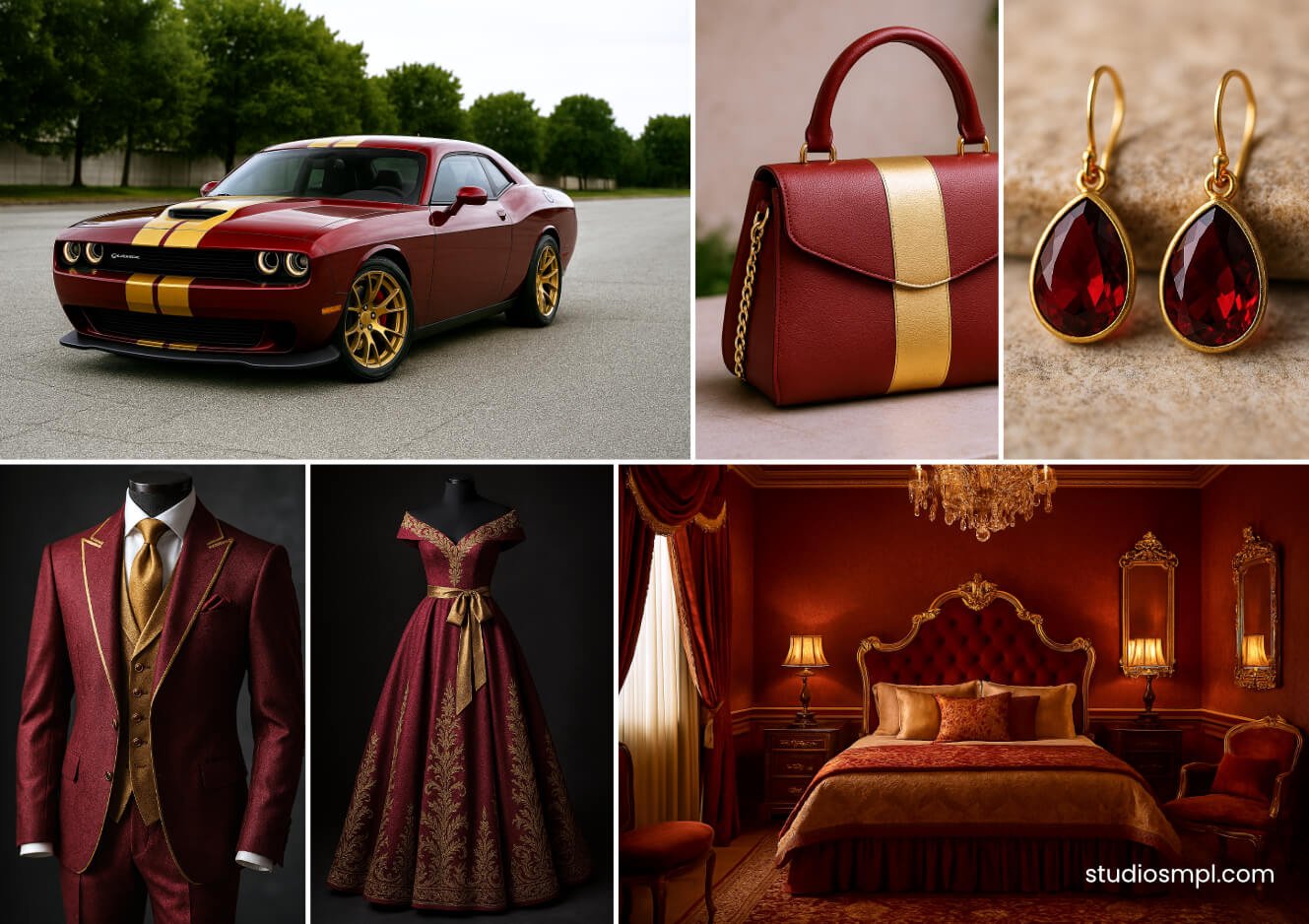
Crimson Red & Gold The Urgent Exclusive
Triggers urgency and perceived exclusivity simultaneously. Best for limited-time offers and luxury launches.
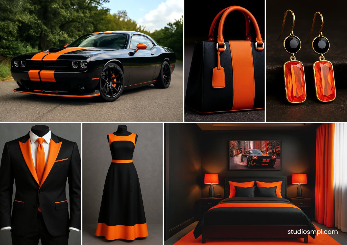
Jet Black & Electric Orange The Bold Contrast
Creates vibrating visual tension. Pure confidence. The pairing for bold CTAs and disruptive campaigns.
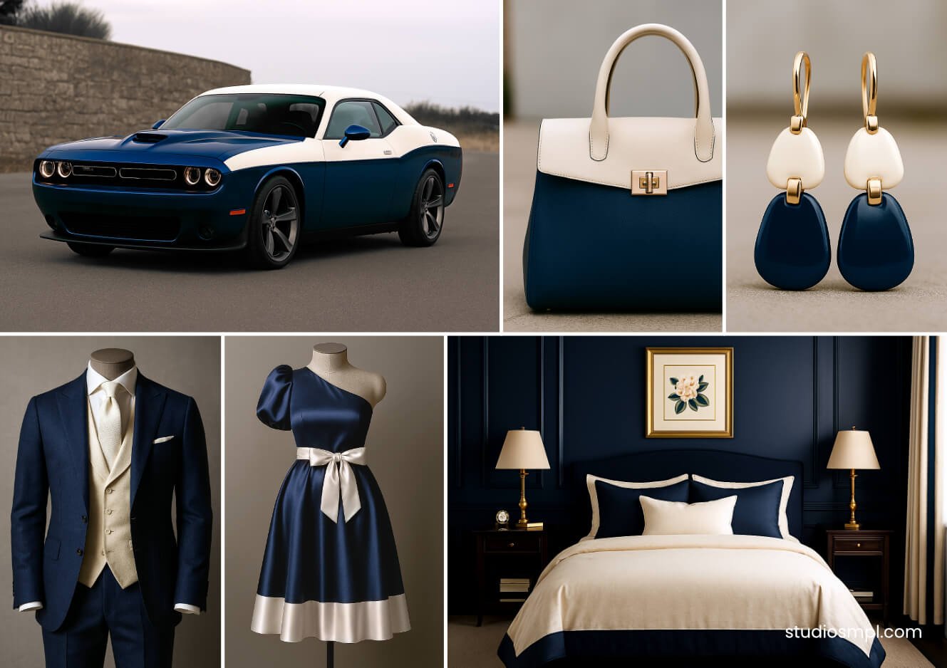
Navy Blue & Cream White The Trusted Professional
Rock-solid reliability, professional without being cold. The right choice for finance, law, or any brand rebuilding trust.
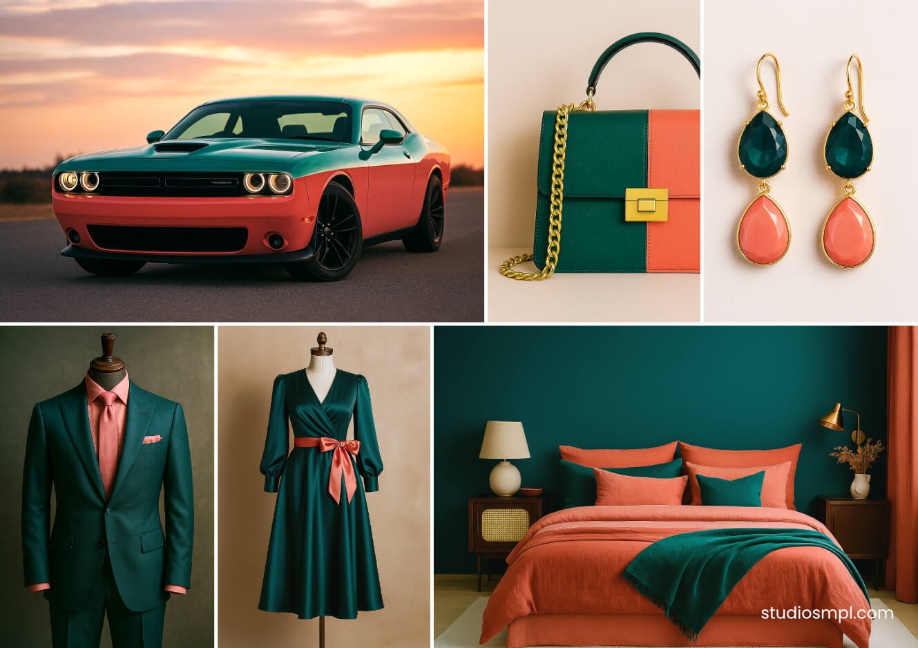
Deep Teal & Coral Pink The Sophisticated Energy
Grounded stability meets optimistic warmth. Premium but approachable. Works beautifully for lifestyle and beauty brands.
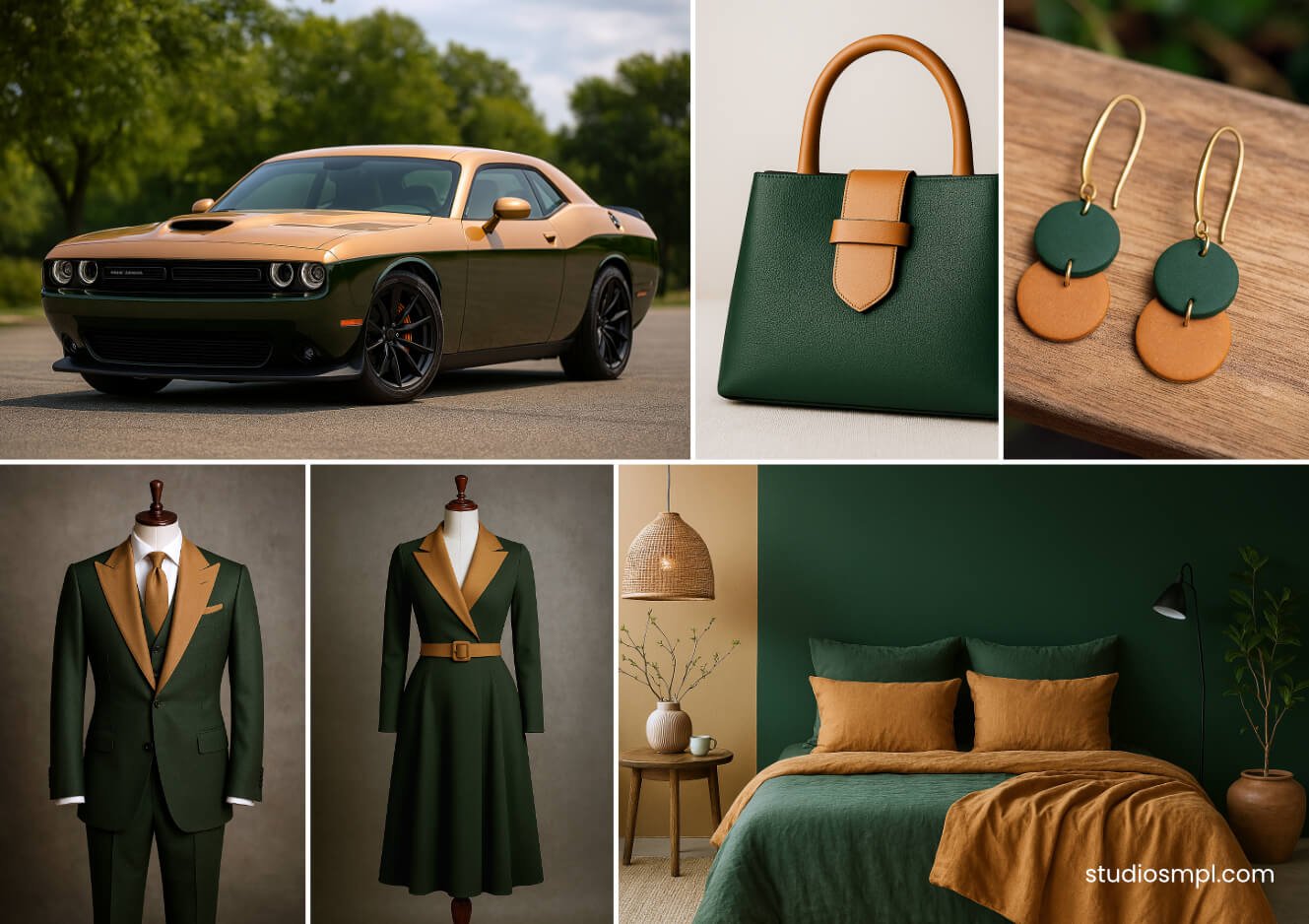
Forest Green & Warm Tan The Authentic Natural
Earthy, honest, organic. The natural choice for sustainability brands, wellness products, and anything that wants to feel genuinely wholesome.
The Bottom Line
Research consistently shows that up to 90% of a customer’s initial brand assessment is based on color alone — and consistent color use can boost recognition by as much as 80%. That’s not a design statistic. That’s a business one.
Your color palette isn’t an aesthetic preference. It’s infrastructure.
Guessing is expensive. Iconic brands like Nike and Apple didn’t stumble into their colors — they chose them with obsessive intent, and then held the line. If your current colors feel like a compromise, or you’re genuinely unsure whether they’re working for you or quietly working against you, that uncertainty is worth taking seriously.