When Nostalgia Wins Over “Modernization” – The Cracker Barrel Case
Evolving a brand isn’t just about keeping up with the times – it’s a balancing act. A new look can show you’re growing, but if you miss the mark, you risk losing what made people love you in the first place. Cracker Barrel’s recent attempt to freshen up its logo is a perfect example of what happens when you forget your roots in the rush to look “modern”.
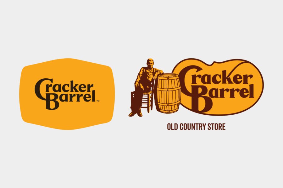
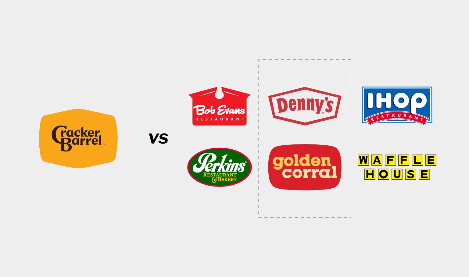
- New Cracker Barrel logo looks like merge of Denny’s and Golden Corral logo – is the brand losing what made it special?
- The new logo missed the mark on tradition, nostalgia, and all those core values people expect.
- Ignoring customers who voice concerns makes things worse. What starts as a bit of feedback can turn into a lot of people tuning out.
Snag five killer questions you gotta ask your designer before you dive headfirst into design project. Subscribe.
After a wave of backlash from customers, Cracker Barrel did something you don’t see every day: they scrapped the new design and brought back the old logo. That move said it all – brand loyalty and emotional connection matter more than chasing trends.
A Logo With a Legacy
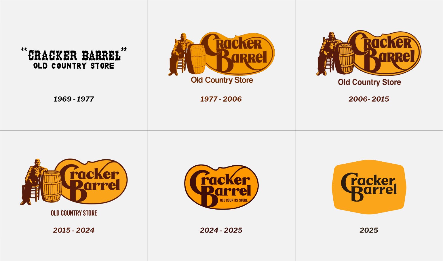
Since 1977, Cracker Barrel’s logo wasn’t just a sign above the door. It told a story. You saw “Uncle Herschel” leaning on a barrel next to a stylized cracker, and you felt the warmth, the nostalgia, the promise of comfort food and tradition. The bold, sturdy letters had a way of saying, “We’re here to stay.”. This identity set Cracker Barrel apart in a crowded world of family restaurants and built instant recognition and trust.
The “Modern” Makeover That Missed the Mark
The new logo? It went for that flat, minimalist look that so many companies seem to chase these days. Sure, it was clean. But in the process, it lost the quirks and personality that made Cracker Barrel… well, Cracker Barrel. The redesign erased the storytelling, blended in with every other chain, and stripped away the emotional cues that kept customers coming back. People noticed – fast. The reaction online was loud and clear: customers and designers alike felt the brand had lost its way.
A Win for Staying Authentic
This wasn’t just a few grumpy comments on social media. Customers spoke up in droves, making it obvious that the old logo meant something. Cracker Barrel listened. By going back to their roots, they showed respect for the community that built their brand and proved that honoring your heritage isn’t old-fashioned – it’s smart business.
If you ask me, there’s a better way to update a classic. Instead of tossing out what works, I looked for ways to evolve without losing the story. Imagine a logo where an ink droplet (a memory) spreads out and forms that familiar cracker shape, with Uncle Herschel still right there – a nod to tradition, but with a fresh twist. Tweak the lettering a bit for clarity, but keep the essence intact. That is how you move forward without leaving your identity and past behind.
What Brands Can Learn
Cracker Barrel’s experience offers some hard-earned lessons:
- Know Your Audience
Figure out what your customers love before you change anything. Nostalgia and recognition are powerful tools. - Don’t Throw Out the Good Stuff
The best updates build on what’s working – they don’t try to reinvent the wheel. - Listen Up
When your loyal customers speak, pay attention. Their feedback isn’t just noise; it’s your roadmap. - Stay Distinctive
In a sea of sameness, your unique character is your edge. Don’t let trends wash that away.
At the end of the day, Cracker Barrel’s story proves that the real power of a brand lives in the feelings people associate with it. Their old logo wasn’t just a design – it was a promise. For anyone thinking about a rebrand, remember: move forward, but never forget what made you matter in the first place.
Anyway, if you want to avoid hiring some random design dud, I’ve got your back. I slapped togethera handy checklist with the five must-ask questions before you commit. Grab it.
Credits & Disclaimer: This is an unsolicited design concept project. Cracker Barrel® is a registered trademark of its owner. I am not affiliated with them. All existing logos and branding materials are used for demonstration purposes only. The purpose of this article is to educate, inform, criticise, and comment on new direction the company has taken. For more visit Terms and Conditions page.