The Psychology of Colors: Make Your Customers Click

What if the wrong color is silently killing your conversions? You can have a perfect product and brilliant copy, but if your palette clashes with your brand’s soul, customers will click away before they even know why. This isn’t just about aesthetics – it’s about wielding a psychological weapon most brands never fully master.
- The Subjective Trap
How “personal taste” leads to chaotic, ineffective branding. - The Biological Advantage
Leveraging hardwired instincts that bypass logic and target emotion. - The Strategic Framework
Moving beyond guesswork to a proven, balanced system.
Think about the last ad you scrolled past. Your brain made a snap judgment: “This is for me” or “No thanks.” Often, that verdict came from color alone. Get it wrong, and it’s a costly, silent disconnect. Get it right, and you unlock instant recognition, deep trust, and decisive action.
Color as a Strategic Tool
Forget the notion that color choice is merely decorative or subjective. For iconic brands, it’s a foundational strategic decision.
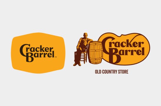
Consider Nike’s Swoosh. Did Carolyn Davidson choose red on a whim? Absolutely not. It was a calculated choice for energy, motion, and action – a direct riff on the wings of Nike, the Greek goddess of victory. Similarly, Rob Janoff’s rainbow Apple logo wasn’t a “groovy mood”, it was a genius communication about the company’s groundbreaking color technology.
Legendary work isn’t about a designer’s favorite hue. It’s about ruthless alignment with brand purpose, supported by research and clear goals. It’s about choosing a color that doesn’t just look good, but does good for the brand.
The Unseen Battle in Your Customer’s Brain
Why does this work on such a deep level? Color operates on a primal frequency.
It bypasses the slow, logical cortex and speaks directly to the instinctual, emotional brain – the “lizard brain”. This is the realm of gut feelings, raw desire, and automatic response. Brands aren’t just picking pretty shades, they’re engineering subconscious triggers.
When done with integrity, it’s effective communication. Great color work earns our respect because it catches the eye, but the product’s quality seals the deal. The formula is simple: Design attracts, quality retains.
The Three Pillars of Color Psychology
Gut Instincts The Caveman Code
Our ancestors survived by reading color. Red signaled danger or food, green promised sustenance. This code is hardwired into our biology. Today, red still screams urgency, while green communicates safety and growth. The meanings are ancient, only the applications have evolved.
Social Vibes The Cultural Layer
Beyond biology, color carries cultural baggage. Blue whispers “trust us” (hence its dominance in finance and tech). Yellow is a wildcard of joy and caution. A designer’s job is to play a high-stakes game of Tetris with these associations, combining colors so their strengths amplify and their weaknesses cancel out.
Visual Hierarchy The Attention Engine
Your eyes are drawn to contrast, not to beauty. Smash a bright accent against a neutral field, and you command focus. Design is the art of dropping breadcrumbs for the eye, guiding it effortlessly to the “Buy Now” button or key message. Choose colors that fight your message, and you create visual chaos. Choose wisely, and you create a seamless path to conversion.
Your Secret Weapon is the 60-30-10 Rule
You’ve likely heard of it – this is the non-negotiable cheat code for professional color application:
- 60% Dominant Color
Your brand’s anchor. It sets the overall mood and feel. - 30% Secondary Color
Supports and complements the main color, adding visual interest. - 10% Accent Color
The “spice”. Used for key actions you want to highlight – buttons, icons, hyperlinks.
This rule prevents the “clown party” effect. It transforms random splashes of color into a cohesive, purposeful system where every hue has a job. If your current materials feel chaotic, this rule is your first diagnostic tool.
A Guide to the Color Spectrum
Choosing color isn’t about finding “good” colors, but the right ones. Here’s the strategic breakdown of key players in your palette:
Red: The Drama Queen
- Power: Energy, passion, urgency, action.
- Peril: Danger, aggression, stress, cheapness.
- Use it to: Stop scrollers, promote sales, excite.
Blue: The Trusted Advisor
- Power: Trust, calm, logic, stability.
- Peril: Coldness, sadness, sterility.
- Use it to: Build credibility for finance, tech, healthcare.
Green: The Balanced Growth
- Power: Nature, growth, health, wealth.
- Peril: Envy, toxicity, inexperience.
- Use it to: Signal eco-friendliness, wellness, financial success.
Yellow: The Optimistic Spotlight
- Power: Joy, creativity, attention, optimism.
- Peril: Anxiety, cowardice, cheapness.
- Use it to: Grab attention, promote creativity, spark happiness.
Orange: The Energetic Call-to-Action
- Power: Fun, friendliness, energy, affordability.
- Peril: Frivolity, impulsiveness.
- Use it to: Encourage clicks, project approachability, highlight value.
Purple: The Luxurious Innovator
- Power: Luxury, creativity, wisdom, spirituality.
- Peril: Arrogance, melancholy.
- Use it to: Elevate beauty brands, denote premium quality, inspire innovation.
Black: The Powerful Authority
- Power: Sophistication, power, luxury, mystery.
- Peril: Grief, oppression, menace.
- Use it to: Craft luxury appeal, create bold contrast, convey sleek modernity.
White: The Pure Canvas
- Power: Cleanliness, simplicity, peace, space.
- Peril: Emptiness, coldness, sterility.
- Use it to: Simplicity, clarity, and making other colors pop.
From Primitive Signal to Psychological Nudge
The use of color has evolved from simple mood-setting to a sophisticated psychological tool. In the digital arena, red is no longer just energetic – it’s a laser-targeted “Click Now!” command. Green isn’t just calm – it’s a “Confirm and Succeed” reassurance.
This is where ethics meet expertise. While colors can nudge, dark patterns – like using high-contrast combos to trap users – exploit this knowledge. The goal should be to guide, not to trick. Your colors must be a truthful extension of your brand’s quality. No palette can save a bad product; it can only amplify what’s already there.
Five Proven Color Combinations That Convert
Here are five high-impact palettes designed to trigger specific reactions:
Crimson Red & Gold The Urgent Exclusive

Effect: Triggers immediate FOMO and perceived luxury. Screams “Limited Time“.
Best For: High-stakes sales promotions, luxury product launches.
Jet Black & Electric Orange The Bold Contrast
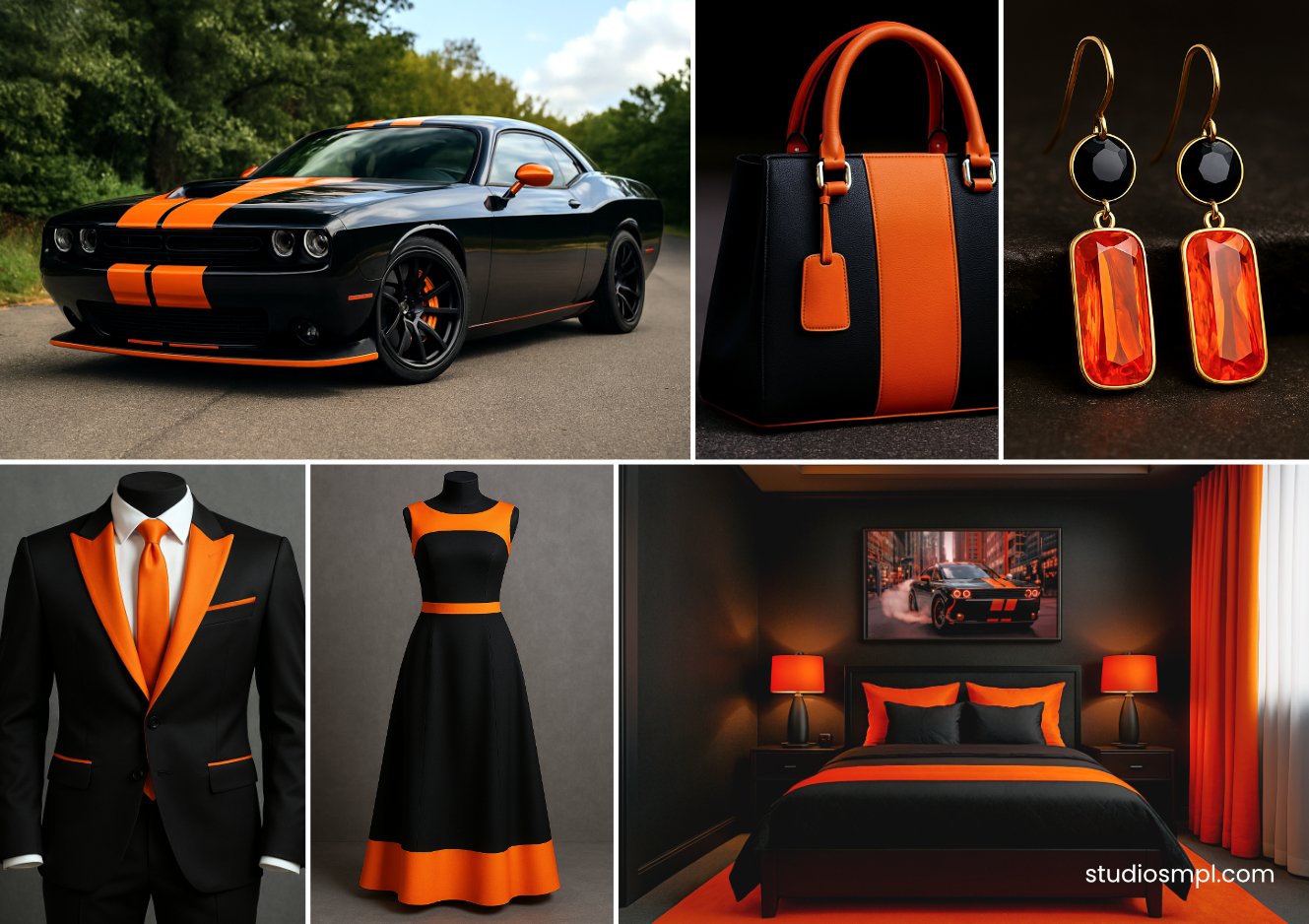
Effect: Creates vibrating, unmissable visual tension. Pure confidence.
Best For: “Add to Cart” buttons, standout call-to-actions, disruptive marketing.
Navy Blue & Cream White The Trusted Professional
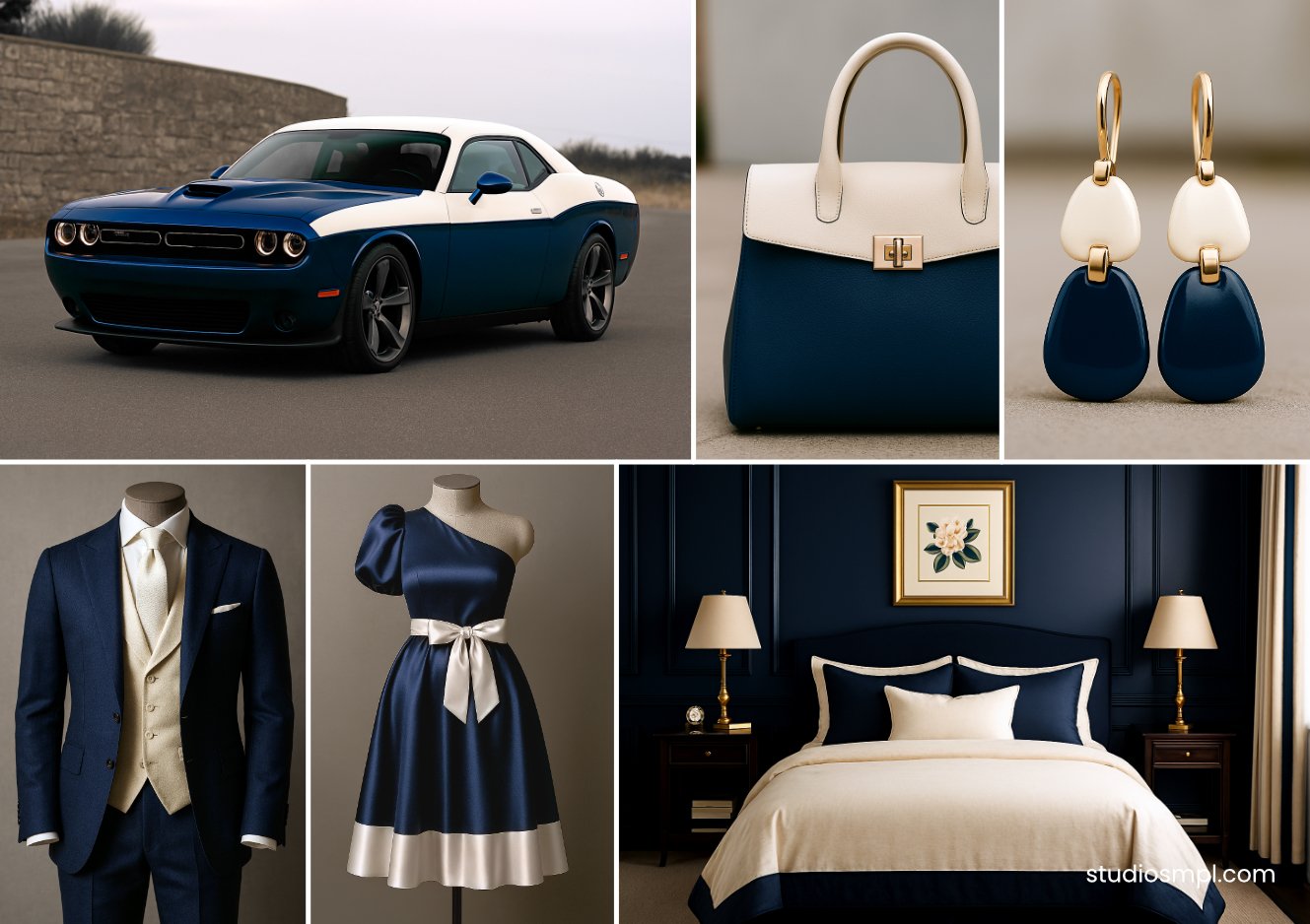
Effect: Communicates rock-solid reliability and calm competence.
Best For: Building long-term trust in finance, law, healthcare, or any rebrand seeking authority.
Deep Teal & Coral Pink The Sophisticated Energy

Effect: Balances grounded stability with optimistic warmth. Upscale yet approachable.
Best For: Beauty brands, creative agencies, lifestyle products aiming for a premium feel.
Forest Green & Warm Tan The Authentic Natural

Effect: Evokes earthy honesty, organic growth, and wholesome reliability.
Best For: Sustainability-focused brands, wellness products, organic goods.
The Unignorable Truth
Research data shows that up to 90% of a customer’s initial brand assessment is based on color alone, and consistent color presentation can increase brand recognition by 80%. Your color palette isn’t an accessory; it’s a core business asset.
Guessing is a luxury you can’t afford. Iconic brands like Nike and Apple achieved their status through obsessive, strategic color choices, not random trends.
Stop Gambling With Your Most Visual Asset
If your current colors feel like a compromise or you’re unsure if they’re working for you or against you, it’s time for a professional diagnosis.
Credits & Disclaimer: The purpose of this article is to educate, inform, criticise, and comment on directions the design industry has taken. For more visit Terms and Conditions page.