The Psychology of Colors: Colors That Make Your Customers Click

Brands get all tangled up trying to figure out how to make people actually care about their stuff – like, how do you go from “meh” to “where can I buy this?”. You know what kills the vibe fast? When the colors are just… off. If the colors don’t vibe with what the brand stands for, or if they feel random, forget it. People pick up on that (e.g. city of Austin new logo). It’s like, you walk by a store or scroll past an ad and your brain goes, “Yeah, no thanks, this isn’t for me”, before you even realize why. If colors clash with the brand’s message, nobody’s gonna bother sticking around to figure out what you’re actually about. It’s a missed connection.
- This isn’t just design theory.
- Some colors trigger FOMO so intense, people regret scrolling right past.
- Eyeballs these days are more valuable than crypto.
You know what’s wild? Tons of companies end up with these ridiculous color schemes because some designer decided to use their brand as a playground for their own “vision”. Like, chill, it’s not your avant-garde masterpiece. If you actually want your brand to look good and not like a unicorn threw up, continue reading to find out how to spot the nonsense – and, more importantly, how to push back if you feel your designer is not understanding your business.
Snag five killer questions you gotta ask your designer before you dive headfirst into design project. Subscribe.
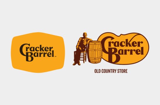
Ask yourself this: Did Carolyn Davidson, the mind behind the Nike’s Swoosh, sit there going, “Gee, do I feel moody today, maybe I’ll throw in some blue?” No. She had a task to make something that shouts speed and movement. So she riffed on the Greek’s goddess of victory’s wings and nailed it. That powerful hit of red wasn’t her “favorite color of the month”, it was a strategic choice for energy and action. Same thing happened with Rob Janoff and the Apple logo. Did he swirl rainbow stripes around the Apple because he was in a groovy mood? No. The company was about to launch its first color monitor. The rainbow? Pixels? Boom, he created instant communication between company and the people.
It wasn’t about personal taste. It was about what fit the brand, with legit research and clear goals. Davidson and Janoff didn’t become legends by designing for themselves. They did it by getting under the skin of the brand and cranking out visuals that made sense on a whole other level.
Why’re Colors Such a Head Trip?
Colors aren’t just wallpaper for your eyeballs. It’s like, straight-up brain chemistry. They slide right past the logical part of our brain, no knocking, and get cozy with our instincts and emotions. We’re talking lizard brain action here – gut feelings, raw wants, the good stuff brands are always trying to poke at. And yeah, those companies know what they’re doing. They aren’t just picking pretty shades; they’re cracking open your subconscious and whispering, “Hey, buy this, you know you want to!”. It’s kind of a genius move.
Even pros aren’t Teflon when it comes to this mind game. Designers just know when the trick is being pulled. Do you think we get salty about it? Nah – we see great color work, we hand out props. If the thing is as good as its products or services, take my money! We give respect where respect is due. Design catches your eye; quality seals the deal. It’s that simple.
Let’s see how color thingy works:
- Gut Instincts (Caveman Mentality)
Ages ago, humans basically had to Sherlock their way through the wild using colors – red meant “look out, could be danger, could be dinner”, green meant “sweet, let’s grow food”. It’s wild how that stuff’s still wired into our heads, right? Even today, red screams urgency, green chills us out or says “Success”. The meaning of colors haven’t changed, what changed is that now we’re using colors to manipulate people into buying stuff or feeling a certain way. - Social Vibes
Today it’s not just about running from bears – there’s whole culture game. Blue means “trust us bro” (no wonder banks and insurance companies drench themselves in it), while yellow’s like the wild card – it’s happy, energetic, but also, hey, caution! Like smiley faces versus warning signs. Every color comes with baggage. So designers basically play Tetris with colors, stacking them in combos that cancel out their bad sides. - What Pops and What Drops
People can’t help but notice certain colors first, especially when you mess around with contrast. Smash a bright color on something boring and watch everyone’s eyes pop straight to it. Designers use that trick to steer your attention – so you see what matters, in order, like breadcrumbs Hansel and Gretel dropped. Design is basically breadcrumb path-making for your eyeballs. But if you screw up and pick colors that fight the message, it’s chaos and people get confused. Colors should give content a boost, not steal the show. If design is all style and zero substance, that’s not design, that’s just art for art’s sake. Real designers are like translators, slipping your brain the info the way it’ll actually stick. Fast. Clear. No mental gymnastics required.
You’ve probably heard folks tossing around that whole 60-30-10 thing, right? It’s basically the cheat code for color in business. Grab your main color, splash that all over – like, sixty percent, everywhere. Then pull in your backup (that’s your runner-up shade, your secondary color), let it have a solid chunk – thirty percent. And the last ten? That’s for your spicy accent color. That’s the pop, the look-at-me part. Suddenly your accent isn’t just screaming for no reason, it’s actually working for you – standing out, not turning your webpage or flyer into some kind of clown party. Try this with the colors you’ve already got. If everything’s duking it out on the screen and nothing feels right, hate to break it to you, but your designer did you dirty.
The Meaning of Colors

Before you slap a bunch of colors on a product or a project, it helps to get why they make people feel a certain way. Every shade has its own vibe, whether we notice it or not. Knowing color psychology isn’t just artsy mumbo-jumbo – it actually matters… a lot.
Don’t believe me? Here, have a list:
Color Red – isn’t just “hey, look at me!” color – it basically grabs you by the gut and yanks your attention, whether you like it or not. It sidesteps all that boring logic and hits you right in the feels. Red color is basically the drama queen of the color world; use it right, and you’re golden… but overdo it, and yikes.
The good stuff:
- Amped-up energy: Red is the adrenaline shot for your brain. Think loud music, fast cars, or saying “YES” to things you’re only kinda ready for.
- Passion & love: Big hearts, roses, lipstick – cliché but true.
- High alert: Throws you into action mode. Plus, it brings some serious excitement and urgency (that “SALE ENDS NOW!” vibe).
- Cozy vibes: Has that fireplace, mulled wine, fuzzy blanket nostalgia built-in.
- Self-confidence: Strutting your stuff, owning the room, power tie – it’s all red.
The ugly side:
- Danger Will Robinson: Red screams “STOP!” or “RUN!” – just look at stop signs and error screens.
- Too much bold: It can make people a bit reckless or daredevil-y.
- Aggro mood: Red has its fists up; think anger, rage rooms, all that fun stuff.
- Stress: Too much red, and suddenly your heartbeat’s up and you can’t relax. There’s a reason medical clinics avoid it.
- Dominance: Sometimes, red’s got a real Napoleon complex.
- Overkill: Drown something in red, and it can look straight-up cheap and aggressive. Like, bad fast-food menu bad.
Color Blue – is like that friend who’s always chill under pressure. People see blue and think, “yeah, I can trust this”. No wonder banks and tech bros gobble it up for their logos. Doesn’t necessarily mean they’re actually honest, but it’s what they want us to believe. Classic marketing move.
The good stuff:
- Trustworthy and solid: That dependable, “we’ve got your back” aura.
- Zen master: Lowers your heart rate, gets you outta panic mode, and makes things feel peaceful.
- Brains: Blue’s like wearing glasses for your mind – rational, focused, all that left-brain jazz.
- Loyalty: A bit poetic, but blue has those “stand by your side” vibes.
The ugly side:
- Icy: Can come off as distant or, y’know, “leave me alone”.
- Sad boi hours: There’s a reason “feeling blue” is a thing – too much, and it’s moody and lethargic.
- Boring: Drown everything in blue, and suddenly the place is sterile, like an airport, or a really boring tech conference.
Color Green – is totally the poster child for “nature vibes”, good karma, and those summer road trips past open fields. Earthy and refreshing… unless you push it too far.
The good stuff:
- Balance: The yoga teacher of colors – gets you centered, makes things chill.
- Growth and hope: New year, new me. Green means go, fresh starts, healing.
- Nature and eco cred: It screams “organic!” or “sustainable!” loud and clear.
- Money: Dollar bills, baby.
The ugly side:
- Jealousy and greed: The “green-eyed monster” is no joke.
- Poison: Sometimes green just screams “do not touch”. Like, actual toxic stuff.
- Rookie: Call someone “green”, and you’re basically saying they’re clueless.
- Snooze fest: Certain greens just look tired, outdated, or kinda sad.
Color Yellow – is like the highlighter pen of the color world. Optimism, energy, a little “hey, look over here!” all rolled together. It grabs your eyeballs instantly – think of sale tags or caution tape, right? It’s the color you pick when you want people to stop scrolling and pay attention.
The good stuff:
- Optimism & Joy: Kind of hard to be grumpy in a bright yellow room. It cranks up creativity and puts people in a good mood.
- Energy: Got a zing to it, like the mental equivalent of a lemon shot.
- Grabs attention: Just like red, you can’t miss it. No surprise you see it on warning signs.
The ugly side:
- Anxiety & Cowardice: Go crazy with yellow and suddenly you’re in the “nervous hospital waiting room” zone. It screams “I don’t feel so good”.
- Criticism & Lies: It’s not always trustworthy in a negative setting. There’s a reason calling someone “yellow” isn’t a compliment.
- Cheapness: Too much? Looks tacky. Hello, discount bin.
Color Orange – is the official “life of the party” color. Orange walks in and everything gets a little bit louder, a little bit wilder. It screams creativity and fun but also shouts “budget-friendly!”.
The good stuff:
- Creative & Fun: Feels like Saturday afternoon, all sociable and playful.
- Energy & Enthusiasm: It’s yellow’s optimism mixed with red’s go-get-’em vibe.
- Eye-catcher: You see orange and think, “Whoa, what’s that?” (traffic cones).
- Budget-friendly: Used for stuff you want folks to actually buy, not just look at (Temu, Amazon, Etsy).
The ugly side:
- Superficial & Silly: Sometimes, orange acts like it can’t take anything seriously.
- Unreliable: Kinda impulsive – might flake on you for something shinier.
Color Purple – rolls up in a velvet robe and expects you to bow. Purple’s been about royalty and wisdom for centuries, and honestly, it walks the talk. Brainstorming something new or getting spiritual? Purple is your (unofficial) guru.
The good stuff:
- Luxury & Creativity: Looks expensive and a little mysterious; think old-school royalty or that artsy friend with a house full of abstract sculptures.
- Spiritual & Mystical: Meditation apps? Tarot decks? They love purple.
- Unique: Spark for originality and innovation.
The ugly side:
- Arrogant & Vain: Sometimes all that royalty attitude gets old-purple can show off.
- Melancholy: A bit dramatic, too. The shade morphs into sad and gloomy if you use it the wrong way (which is good for those offering funeral services).
Color Black – is the “I woke up like this” of colors. Black is strong, slick, and universally cool. Design-wise? It’s that final boss when you want sophistication, modernity, or full-on luxury. But, technically black isn’t even a color – just no light at all.
The good stuff:
- Elegant & Fancy: Nothing beats a classic black suit or dress.
- Power & Strength: Feels solid, reliable, sorta “don’t mess with me”.
- Mysterious: Alluring. A little dangerous, like Batman.
The ugly side:
- Death & Grief: Funerals, bad news, the “lost all hope” shade.
- Depression & Sadness: All black everything can get a bit heavy on the soul.
- Threatening & Evil: Used when you want to seem a touch intimidating or villainous.
Color White – is the “new phone, who dis?” of the color scene – blank, clean, kinda intimidating in its emptiness. In design, it’s minimalism central: less clutter, more breathing room for your eyeballs.
The good stuff:
- Pure & Innocent: Weddings, first communions, medical labs – white keeps it holy.
- Simple & Spacious: Let’s your designs (and your brain) spread out and chill.
- Peaceful & Organized: Instantly tones down the chaos.
The ugly side:
- Sterile & Cold: All white can feel like you’re living inside a giant refrigerator. Nobody wants that.
- Isolated & Boring: White walls, white table, white floor… hello, monotony.
- Surrender & Weakness: White flag? Yeah, that’s literally “I give up”.
Colors are emotional puppet masters. Take orange or yellow – they’re like a jolt of morning sunshine, making you feel a bit more chipper or sparking some creative juice. Blues and greens are your zen zones, all chill and calming, like a Spotify playlist for your eyeballs.
But then there’s red. Red’s a drama queen. It screams passion and urgency, but also, “Hey, watch out!”. And black or white – yeah, technically not colors, but they’re loaded, right? Black’s that sharp-dressed mysterious friend; white, your go-to for anything clean or ceremonial.
Thing is, your brain’s not just reacting randomly. Culture, instincts, weird stuff you went through as a kid – it all gets mixed in. Brands, designers, and artists figured this out ages ago. That’s why fast food joints lean hard on red and yellow, and spas can’t live without green and blue. If you actually get how color talks, you’re halfway to Jedi-mind-tricking people – at least when it comes to vibe-setting or selling stuff. Just be sure you sell good stuff, so no one gets mad on how you use colors.
From Eye Candy to Mind Games
Colors in design have gone on a real trip, from just making things look pretty and fancy to actively messing with your head.
Old School Vibes
Back in the day, color usage was simple. Wanna set a mood? Boom – pick a color. Trying to keep your brand feeling swanky or trustworthy? Toss those iconic colors up on your sign or poster. Everyone just wanted the flyer for your ska band or grandma’s bake sale to pop. The choice of color was honestly more about aesthetics than trickery. At most, you’d see color hinting at the theme (Halloween = orange and black, shocking, I know), but nobody was trying to rewire your brain. You saw the poster, got what you needed, and the next move was totally yours. No funky hidden agendas.
Digital Chaos
Fast-forward to scrolling hell, and colors got a new gig. We’re not just talking “ooh, pretty” anymore – nah, every hue’s got an agenda. I mean, red? Forget classic energy or love. In the digital world, red is screaming, “Click me NOW!”. Ever find yourself rage-buying a T-shirt at 3am because you saw a flashing red SALE button and then immediately regretted it? Welcome to the club. And yeah, it’s not always your fault. Here is how and why:
- Brands these days know what they’re doing. It’s all about nudging you to spend, even if you’re broke or just… not interested. Green’s not chill anymore either. Now it’s more like, “Congrats, you made it to the next level! Hit confirm, you’re almost there!”. Even color combos – those loud, high-contrast blues, yellows, whatever – they’re strategically screaming at you to cough up your email or slap that “Buy Now” button.
- Modern “design” is psychological warfare – especially in UI and UX. Sure, there are supposed to be ethical guardrails (good luck enforcing those), but with psychology getting mixed in, now you’ve got brands low-key exploiting everyone for clicks and cash. Enter the nightmare zone: dark patterns. Half the time you’re not even making choices, they made them for you ages ago, you’re just catching up.
- Marketing runs the show. Basically, marketing suits are forcing designers to pull these stunts to chase bigger profits. And yeah, sometimes you actually get something good outta the deal, but how often is that really the case? I’m not saying every regretful purchase is the internet’s fault (sometimes we do just make dumb decisions on our own) – but the lines are pretty damn blurry nowadays.
You see, colors can totally mess with people, or straight up make your brand pop (sometimes in a kinda sketchy way). So, don’t just slap some random rainbow mess on your stuff and call it a day. Really think about what your brand stands for, what you want to say. Don’t just wing it, tie those colors back to your philosophy or whatever your vibe is with which people resonate.
When you’re running a promo, go ahead – be bold! Grab attention. Just, don’t go full ‘60s acid trip unless that’s literally your brand. People remember when brands look like they ate a box of crayons, and not in a good way. Like, keep some chill.
If you’re going with cooler colors, maybe talk to people a bit more – blues and greens kinda keep it low-key and you wanna make up for it with human interaction. And look, I’m just gonna say it: colors can only do so much. If your products are trash, no amount of Pantone wizardry is gonna save you. Don’t expect miracles. They’re here to boost, not bail you out.
5 Color Combos That Practically Punch You in the Face
If you want your designs to snap people out of their scrolling comas, these color duos basically do the heavy lifting for you. Just, y’know, don’t abuse the power.
All-Out Alert: Crimson Red & Gold
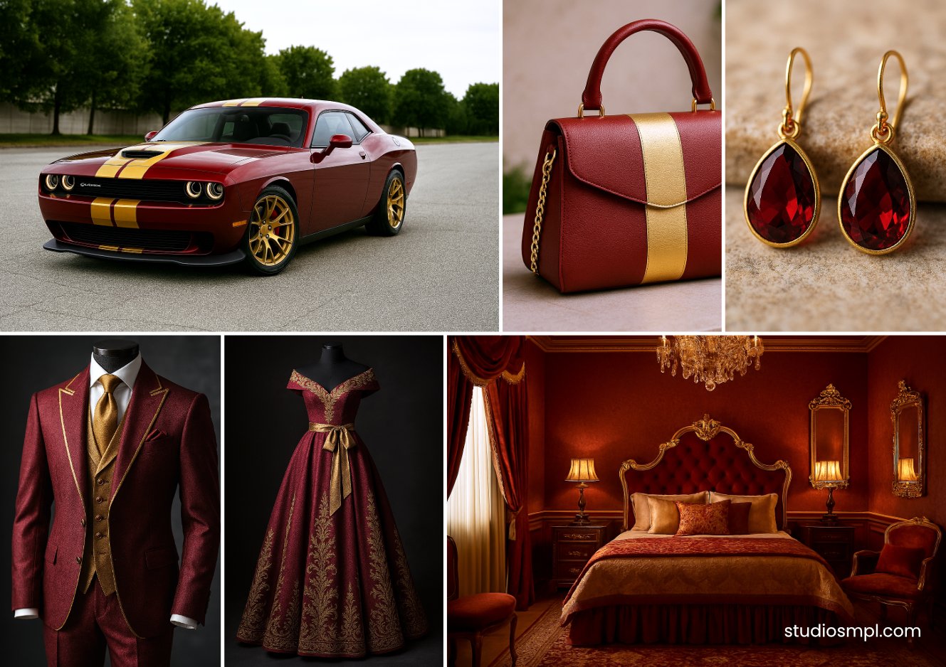
Boom – instant adrenaline. Red basically leans in and screams “LOOK HERE!” while gold brings the bling and a vibe of exclusivity and luxury. This duo says, “You snooze, you lose, buddy”.
Where to use it:
- That “limited time only” sale button? Slap it on there.
- Big promos. Luxe products. Anything that should look like a can’t-miss deal.
Heads up:
No chill here. You’ll trigger FOMO so intense, people might regret scrolling right past.
High Voltage Contrast: Jet Black & Electric Orange
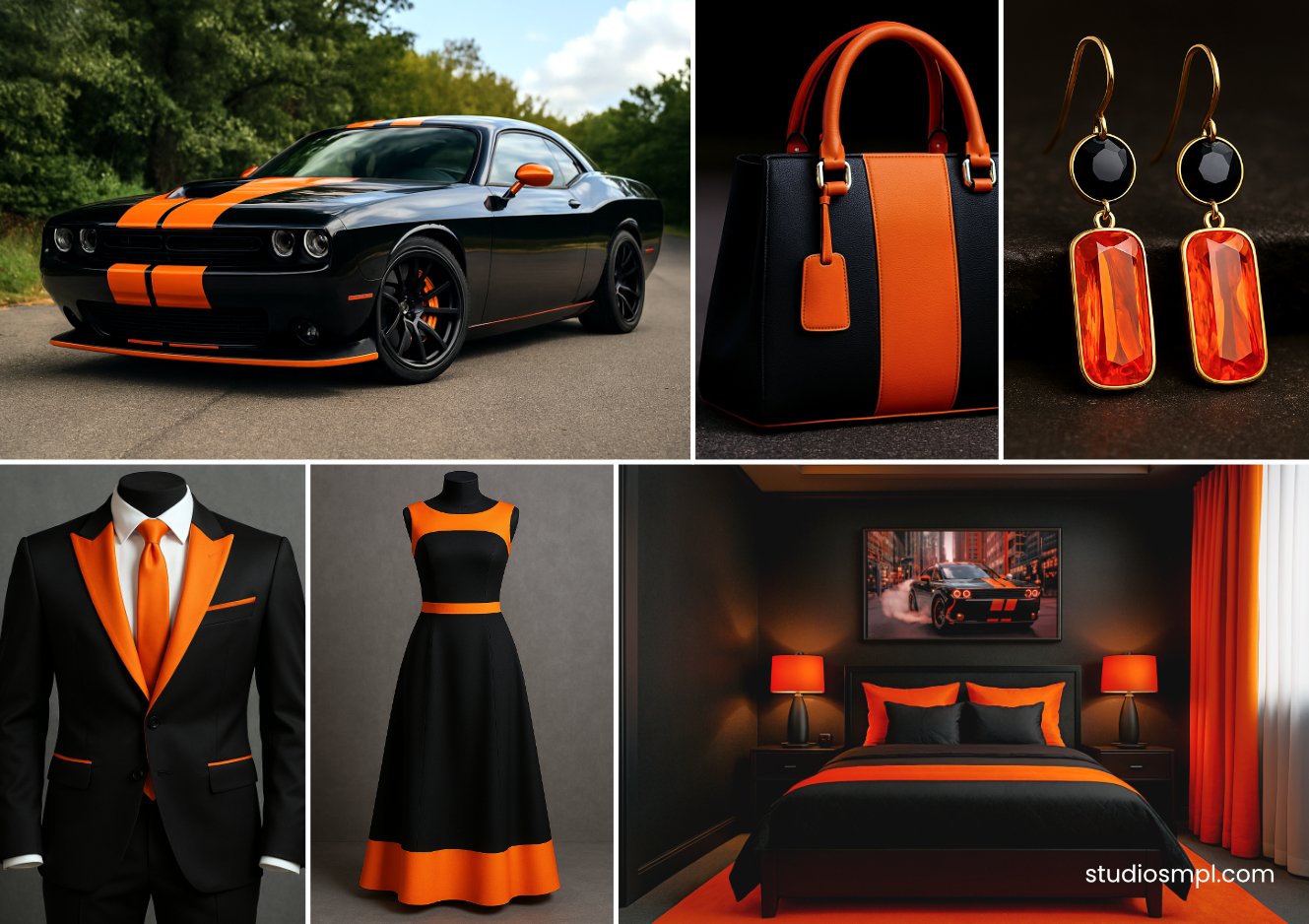
If subtlety isn’t your jam, this is it. Black lays the swagger, orange brings the wow. The contrast is so sharp it practically vibrates.
Where to use it:
- Any button you want SEEN – “add-to-cart”, “subscribe”, whatever.
- Guerrilla style posters and marketing, but honestly, watch out for places already drowning in warm colors or you’ll just blend in.
Word of caution:
Overdo the contrast, and it’s like staring into the sun – your design gets exhausting or just straight-up tacky. Like, dollar-store flyer-level.
Smooth Operator: Navy Blue & Cream White
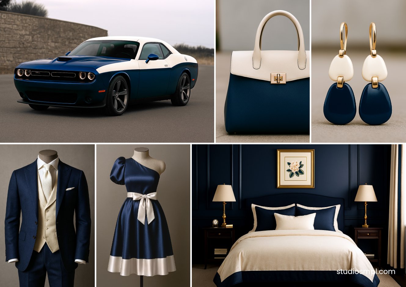
Blue’s the dad of colors – never lets you down. Cream chills it out, softens the edges, and suddenly you’ve got this combo that screams, “I know what I’m doing”. It’s got that whole reliable, sharp-dressed energy. If colors had jobs, this duo would run the office.
Where to use it:
- Brands trying to play the long game – think banks, doctors, or any business where trust beats hype.
- Totally works for both old-school and cutting-edge rebrands.
Hot tip:
Go too heavy on blue, and you’re in yawn territory. Gotta balance or people will sleepwalk right past your ad or promotional prints.
Feeling Spicy: Deep Teal & Coral Pink
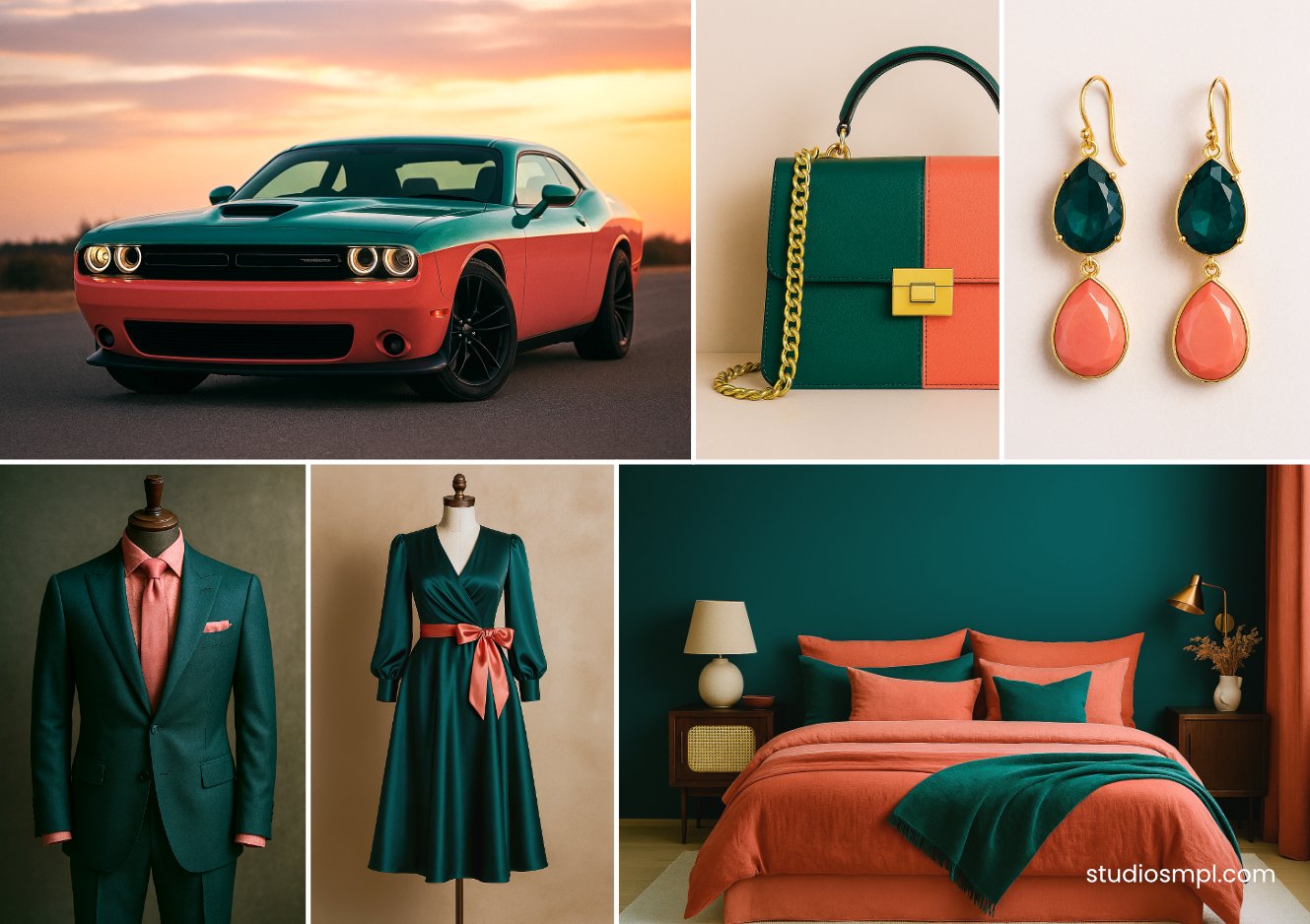
So here’s one for when you want some “oomph” AND class. Teal keeps things grounded, coral’s got that summer-sunset punch. It pops – but not in a “neon headache” way.
Where to use it:
- Upbeat beauty brands, tropical anything, cool wellness stuff.
- Wanna feel even fancier? Toss gold in the mix.
Warning:
This can go from chic to mess real quick if you don’t keep it tidy. If it feels harsh or random, you lost the plot.
Down-To-Earth Vibes: Forest Green & Warm Tan
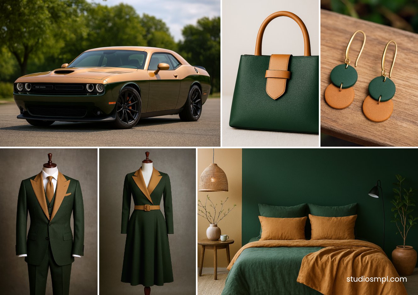
For all the nature lovers and eco-warriors – here’s your jam. Green = growth, tan = earth. It just feels wholesome and real.
Where to use it:
- Organic groceries, wellness shops, brands yelling “we care about the planet, hell yeah”.
- Perfect for “submit” or “confirm” buttons where you want to whisper, “No regrets”.
Thing is:
It can get pretty blah if you don’t spice it up. In a sea of brighter colors, it just fades away. So, maybe don’t use it on a Vegas billboard, yeah?
These combos work, but only if you know your audience and keep design rules in check. Spamming red and gold everywhere? That’s not urgency, that’s chaos. Use colors wisely.
Did you Know?
The SEO company, Reboot – they dug into the whole brand thing and, 78% of people remembered brands just because of their colors. Not the names. Only like 43% bothered to remember the names. Wild, right? Basically, the study screamed, “Hey, if your brand color game is strong and doesn’t change every Tuesday, people will notice you way more”. Free marketing, basically. Color me not surprised.
Here’s the Deal
Quit gambling with your brand’s colors. Davidson and Janoff didn’t just wing it with whatever looked hot that week – they got borderline obsessive about color psychology. Mad scientist vibes, to be honest.
If you’re tired of guessing and want a color strategy that actually works for your business, not your designer’s ego, I offer a one-time free Color Audit. I’ll review your current stuff, break down exactly what’s dialed in, what’s hurting you faster than Comic Sans, and serve up advice you can actually use. Just go to Simple’s contact page, and enter “I want FREE Color Audit” into Subject field.
Attention’s worth more than Bitcoin lately. You can’t afford to slap random “trendy” shades around and pray for miracles. You need identity.
Anyway, if you want to avoid hiring some random design dud, I’ve got your back. I slapped togethera handy checklist with the five must-ask questions before you commit. Grab it.
Credits & Disclaimer: The purpose of this article is to educate, inform, criticise, and comment on directions the design industry has taken. For more visit Terms and Conditions page.